Agency: The Bannermen
ESTER-C
Ester-C Plus is a regulated product, so its advertising has to carry approved health-claim wording alongside anything the campaign wants to say for itself. The brief needed five separate propositions on top of that, fast-acting, immunity, energy, vitamin C and on-the-go, plus footage of a sachet being mixed into water. A 300x250 holds a clip, a five-line headline and a block of mandatory legal text in one frame at none of their legible sizes.
The message was distributed across the rotation instead. Footage ran first, then the five lines built one at a time on white, then the pack shot arrived with the call to action. Legal text sat as a constant along the base of every frame after the video, so it never competed with the headline for the same space. In the smallest mobile sizes the footage was dropped rather than shrunk, on the reasoning that an illegible clip and unreadable copy both fail, but only one of the two is compulsory.
Font: Gotham



75 YEARS
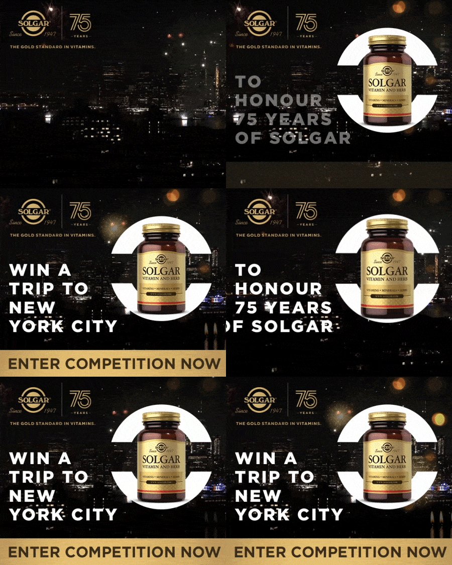
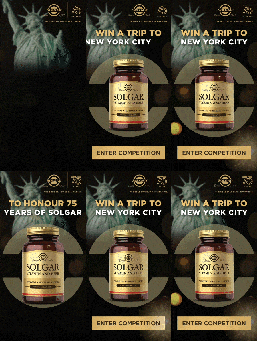
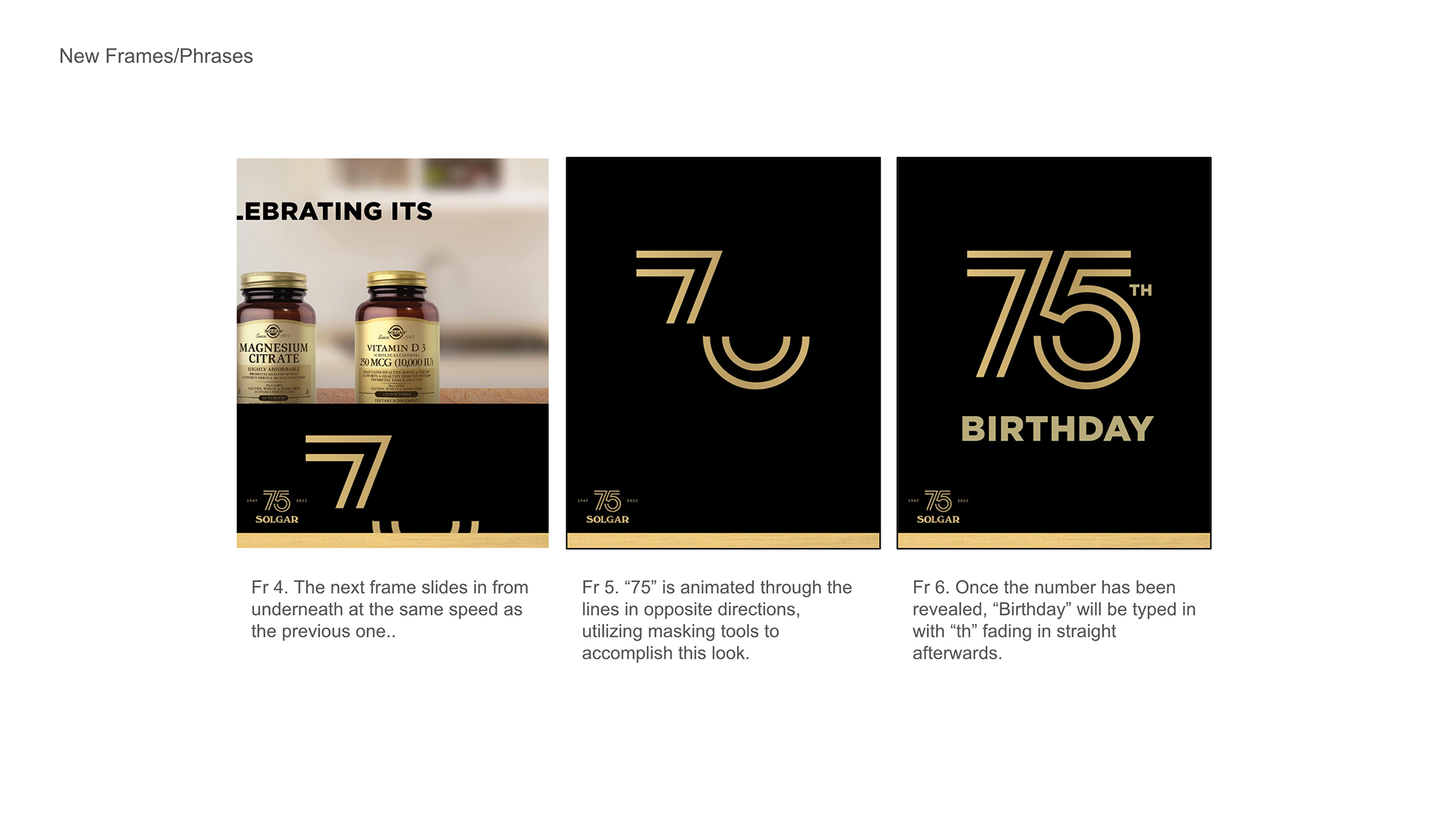
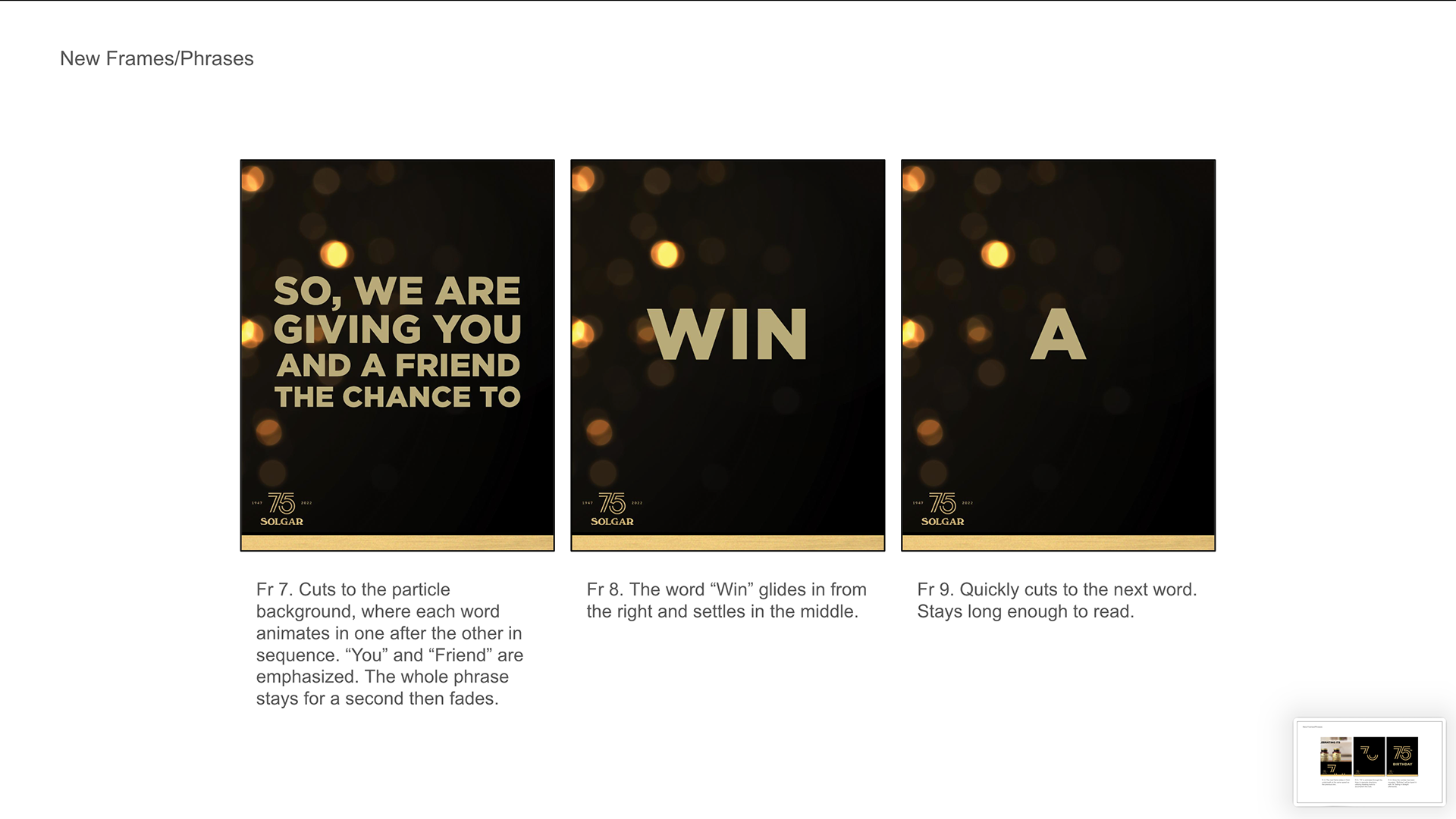
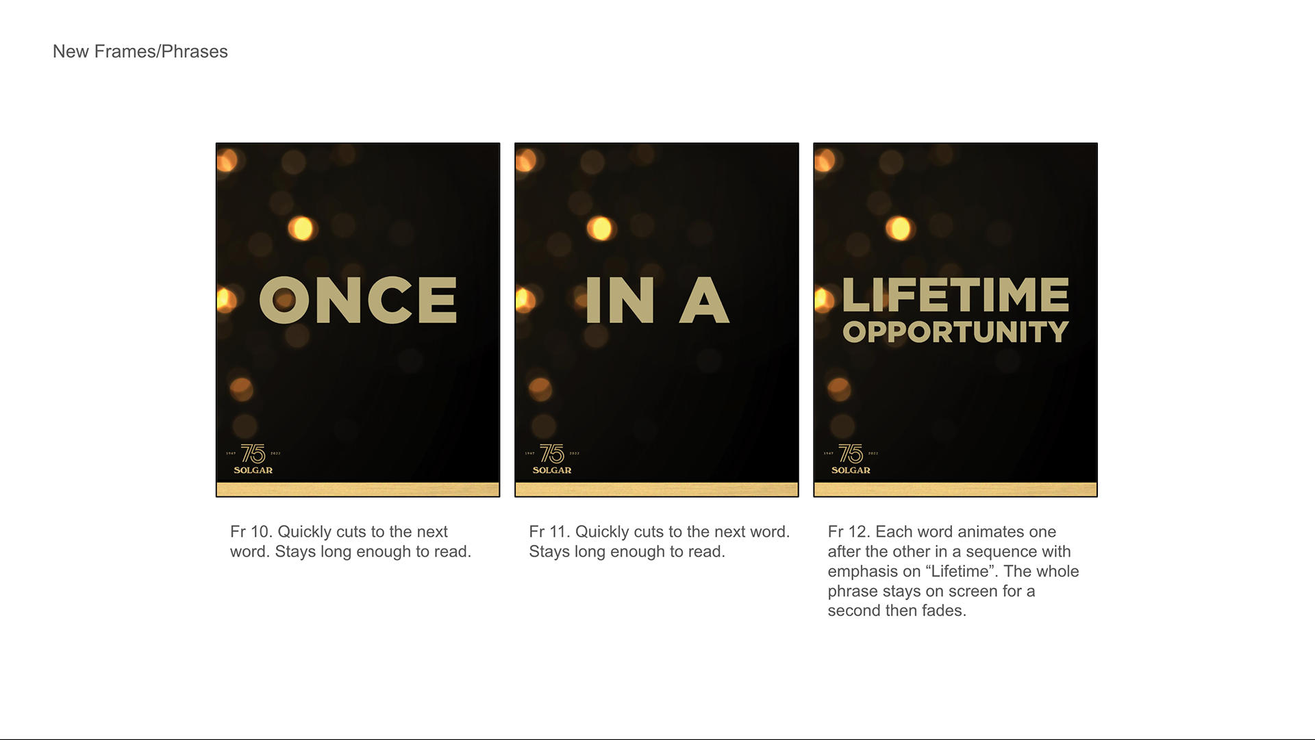
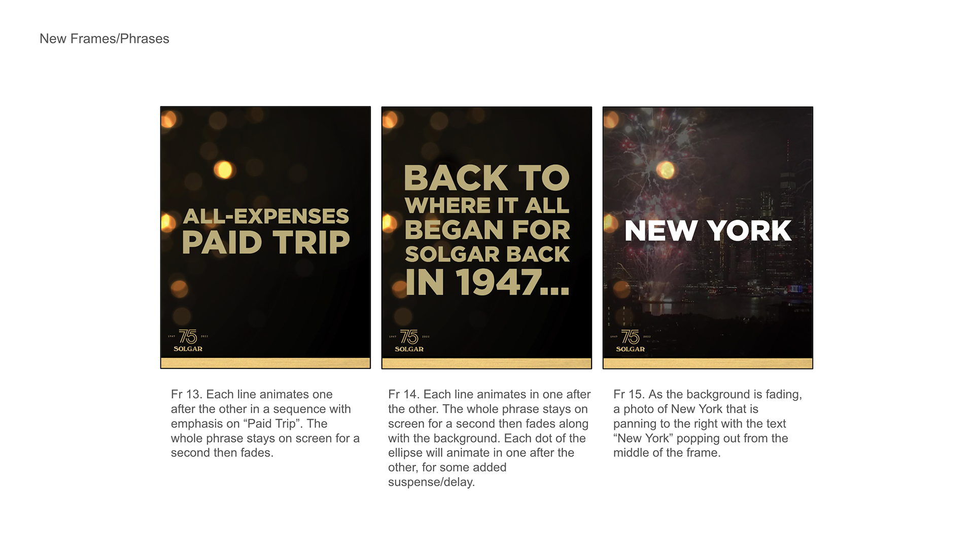
Solgar's 75th anniversary was marked with a competition to win a trip to New York, and the same animation had to serve both HTML5 banners and social video. The two formats share almost nothing: banners loop, run silent and sit under a file limit, while the social cut plays once and carries audio. Building them separately would have meant two pieces of work and two sets of timings to hold in step through every round of revisions.
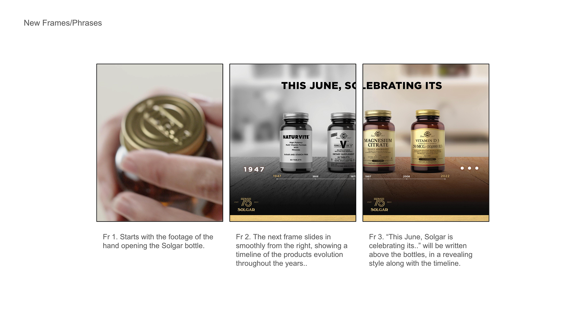
A night skyline with fireworks carried the anniversary and the destination in a single image, so the same footage worked whether it looped or played once. The sequence was storyboarded before any animation began, agreeing the beats while they were still cheap to move, then built once and cut two ways. The brand's arc device opened across the frame to reveal the bottle, giving the product a mechanism rather than a fade.
Font: Gotham


ULTIMATE CALM
Ultimate Calm was one of two updates to a campaign already in market, swapping in new pack shots and copy while leaving the rest in place. Revisions like this are judged against the version already running rather than against a brief, so any shift in spacing, timing or weight would read as an error rather than an update. The published banners were the reference throughout.
The product sits inside a fixed circular aperture built from the brand's arc device, and that is what made the swap cheap. A new pack shot drops into the same aperture without disturbing the layout or the timings around it, so the update touched the artwork and nothing structural.
Font: Gotham