LISTERINE
Agency: The Bannermen
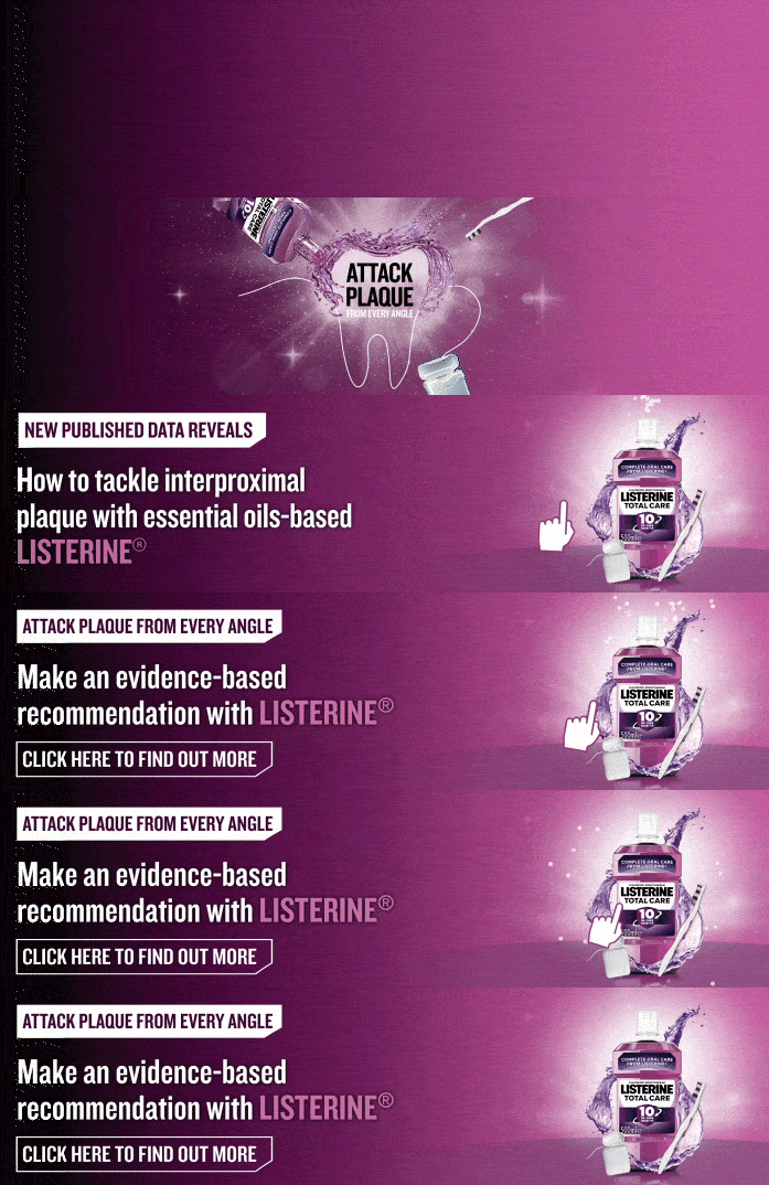
Listerine required both the copy and the animation to appear in every resize, with nothing dropped for the smaller formats. The campaign addressed dental professionals rather than consumers, so the copy had to carry a clinical claim and a reference to newly published data, neither of which shortens well. A liquid swirl built around a line-drawn tooth occupied the centre of the frame, which was exactly where the longest line of type needed to sit.
Several layouts were put to the client rather than one, so the trade-off between copy and animation was theirs to weigh rather than being settled before they saw it. In the landscape sizes a larger gradient was introduced behind the type, lifting it clear of the swirl without dimming the movement underneath. Every size carried the full claim, the data reference and the animation, and closed on the call to action rather than compressing it.
Font: Knockout, VAG Rounded



SNAPCHAT
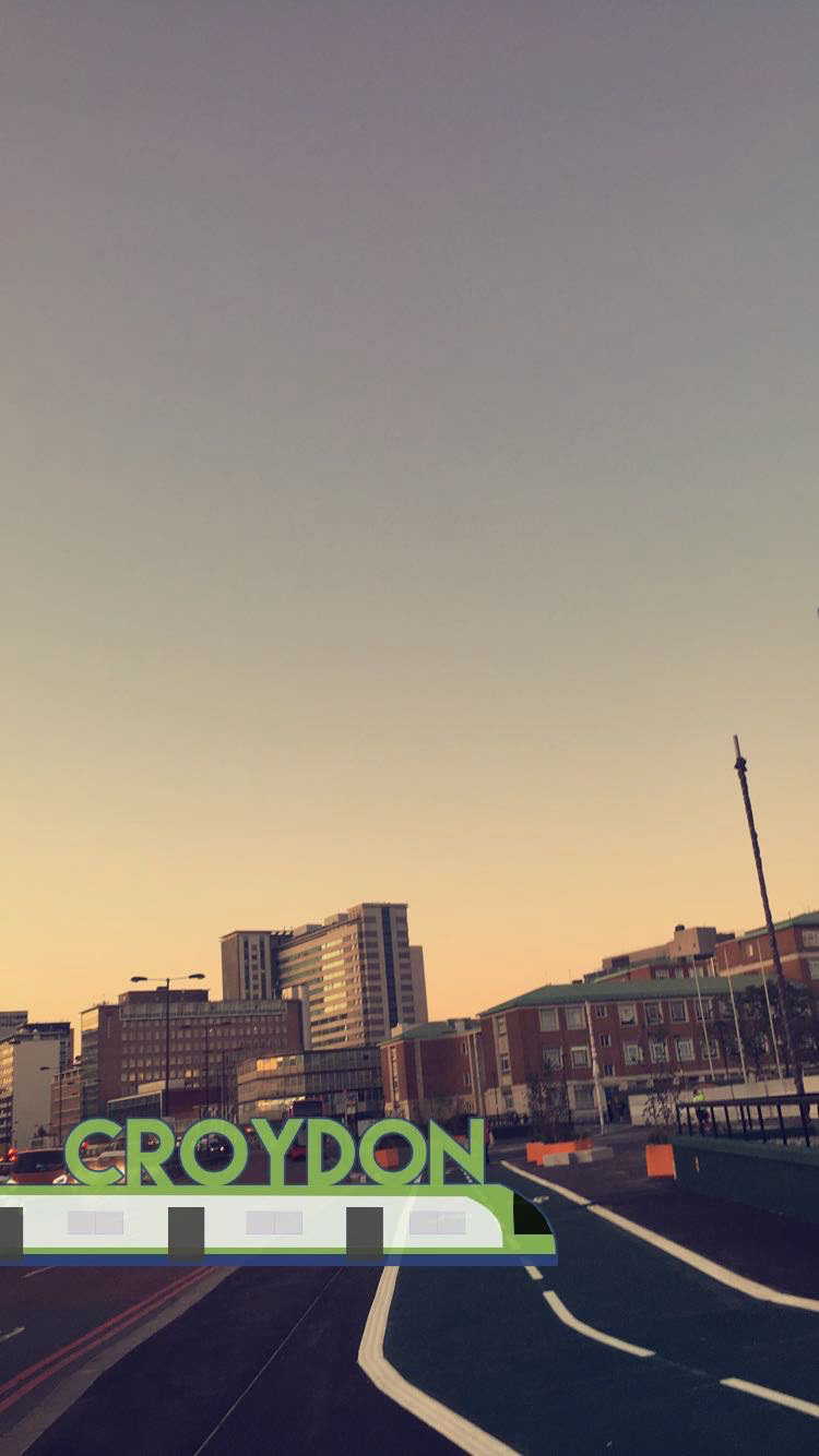
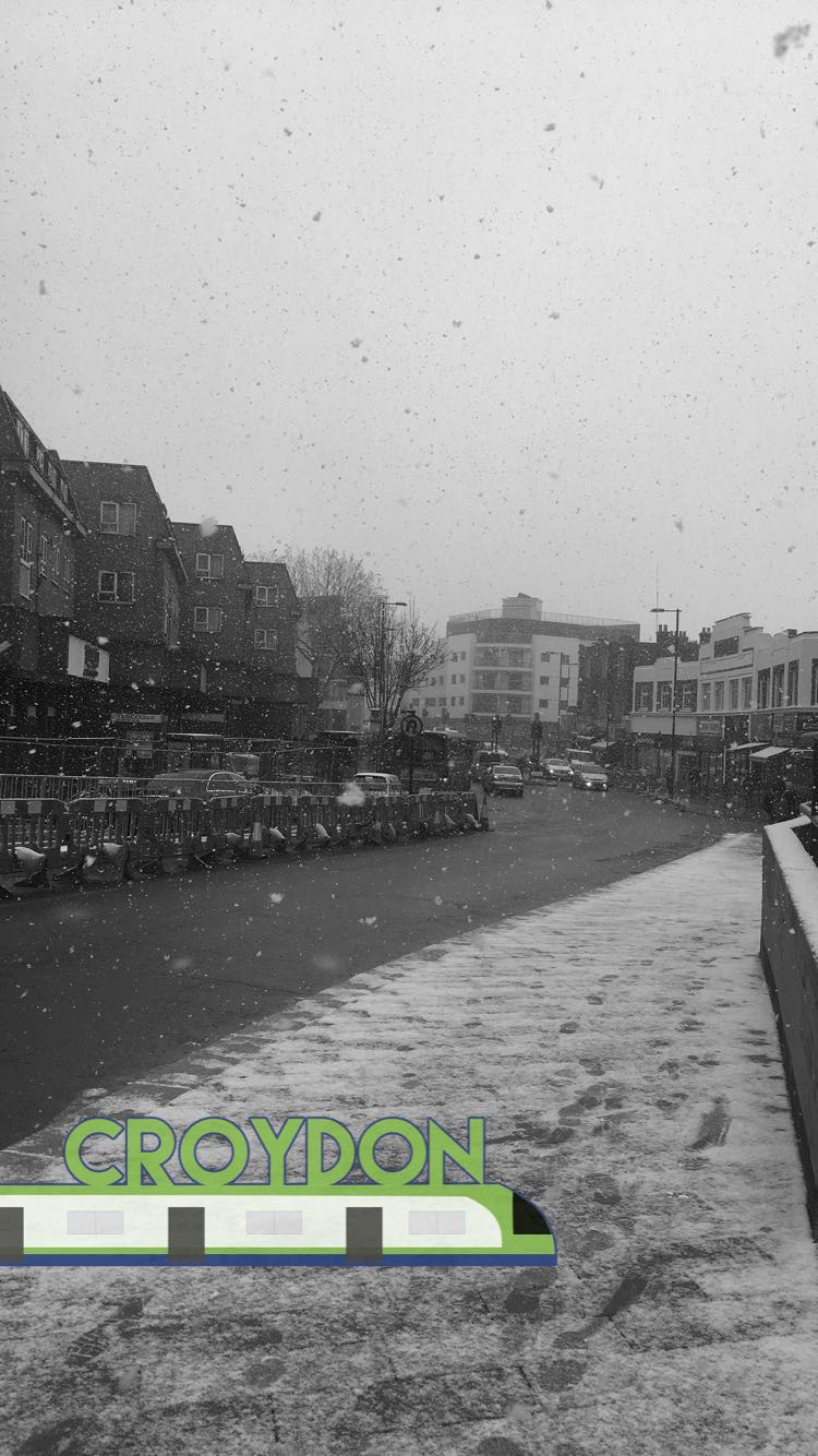
When Snapchat opened geofilter submissions to designers for their own areas, a set was developed for Croydon. Croydon Tramlink's branding was the starting point, being the most locally recognisable thing available. Research into filters already running showed the field was almost entirely typographic, so a text-only design would have been accurate to the format and invisible within it.
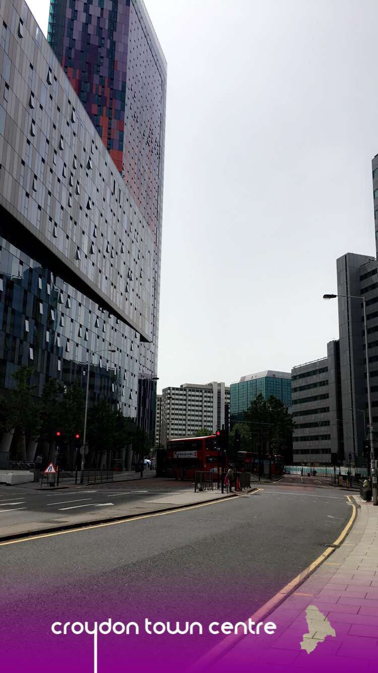
The tram itself was drawn in beneath the copy, giving the filter a form no other local submission had while keeping the type legible over whatever the camera was pointed at. Three designs went in: a roundel borrowing the tram network's own visual language, a wordmark with the tram beneath it, and a script treatment sitting on a gradient footer. Image 4 was the initial concept, image 5 the first to be approved, and image 7 followed a year later. Both approved filters are still in use.
Font: Lemon Milk, Smooth Circulars




BULK
Agency: The Bannermen
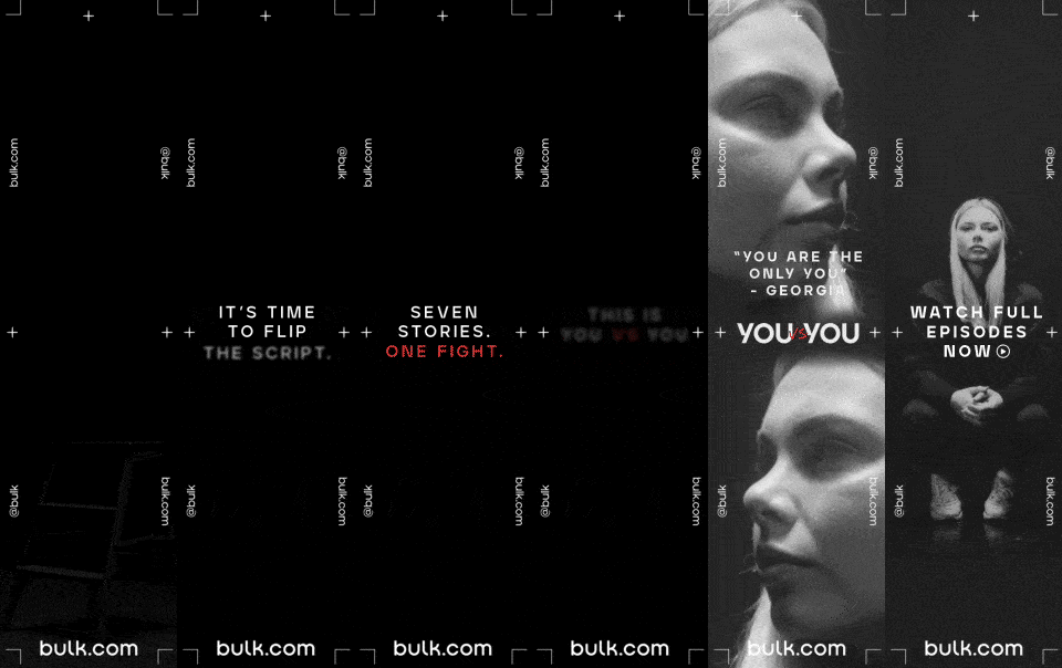
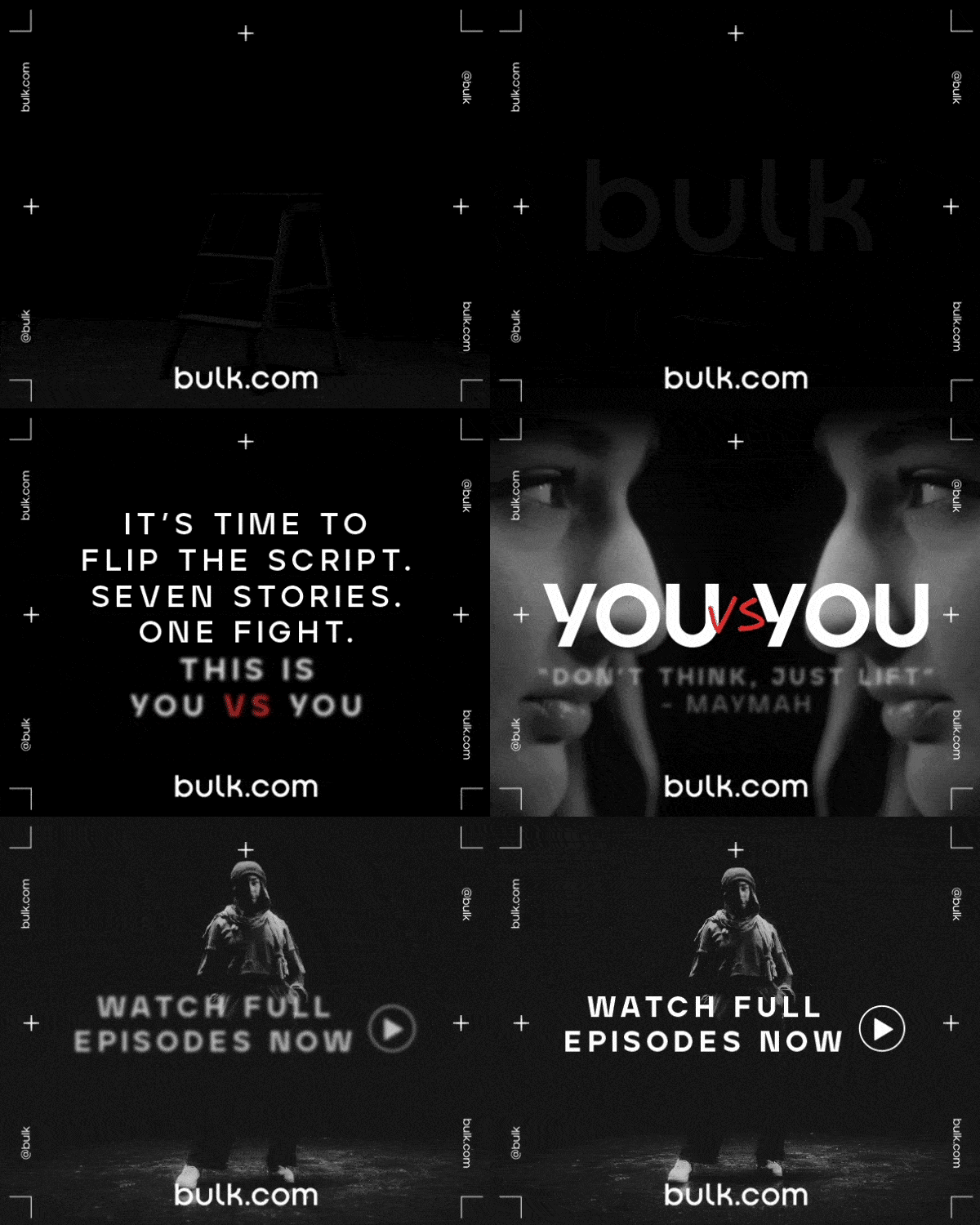
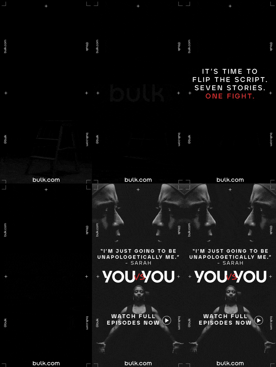
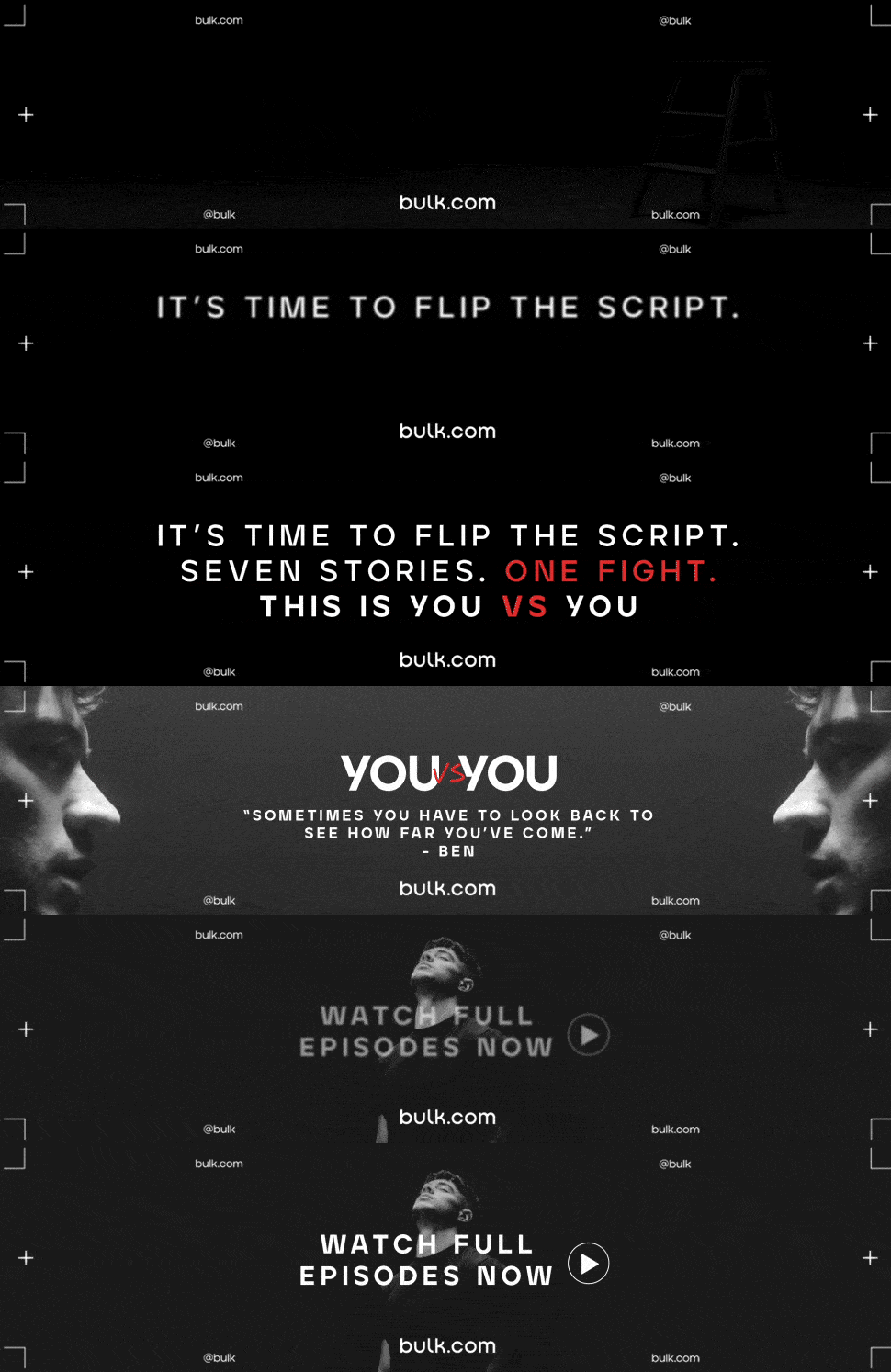
Bulk needed twenty designs, four versions at five sizes each, promoting You vs You, a seven-part film series built on athletes' own accounts. Produced independently that would have been twenty separate layout decisions and twenty opportunities for the set to drift apart. It had to read as one series with four entry points rather than four campaigns sharing a logo, which meant the structure had to be settled once and then held.
The 300x600 DMPU was settled first, being the shape that adapted most readily to the rest, and the remaining nineteen followed from it. A viewfinder device carried the identity, corner brackets and registration crosses framing every size with the wordmark locked to the base. Photography ran monotone with red held back for a single word, so the four versions could differ entirely in imagery and still register as one thing at a glance.
Font: Bulk Sans