Agency: Format
MLR
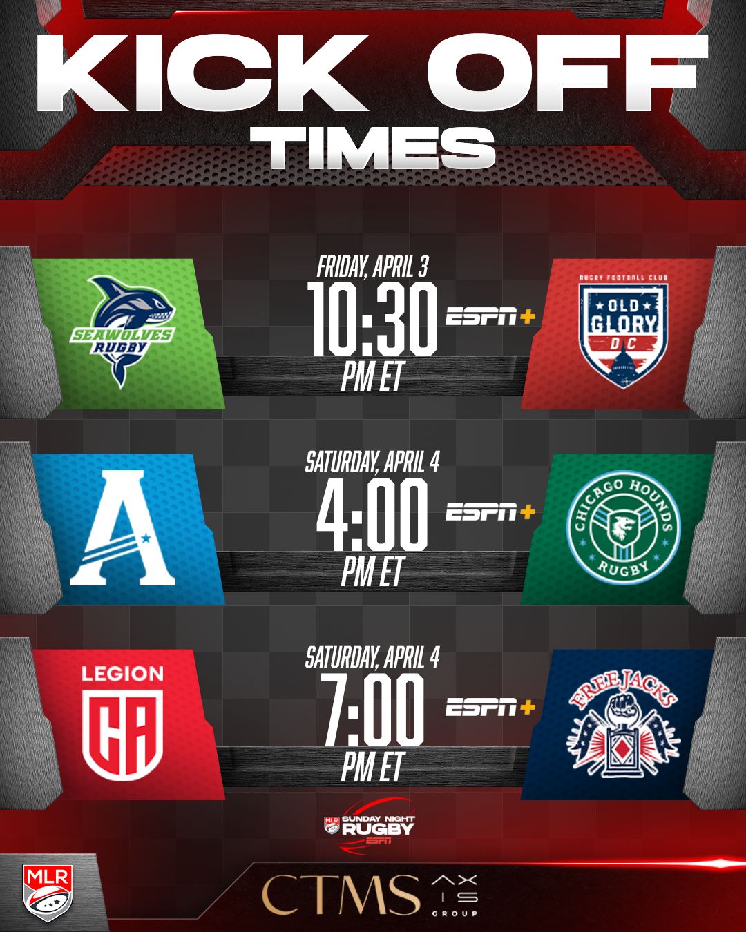
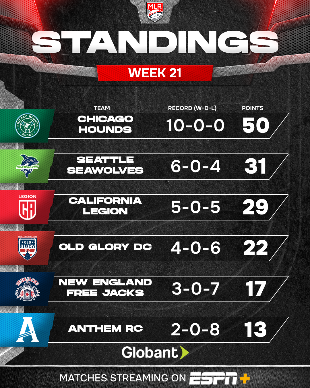
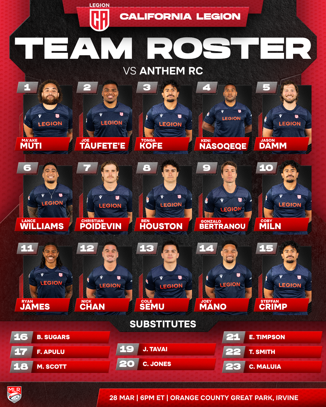
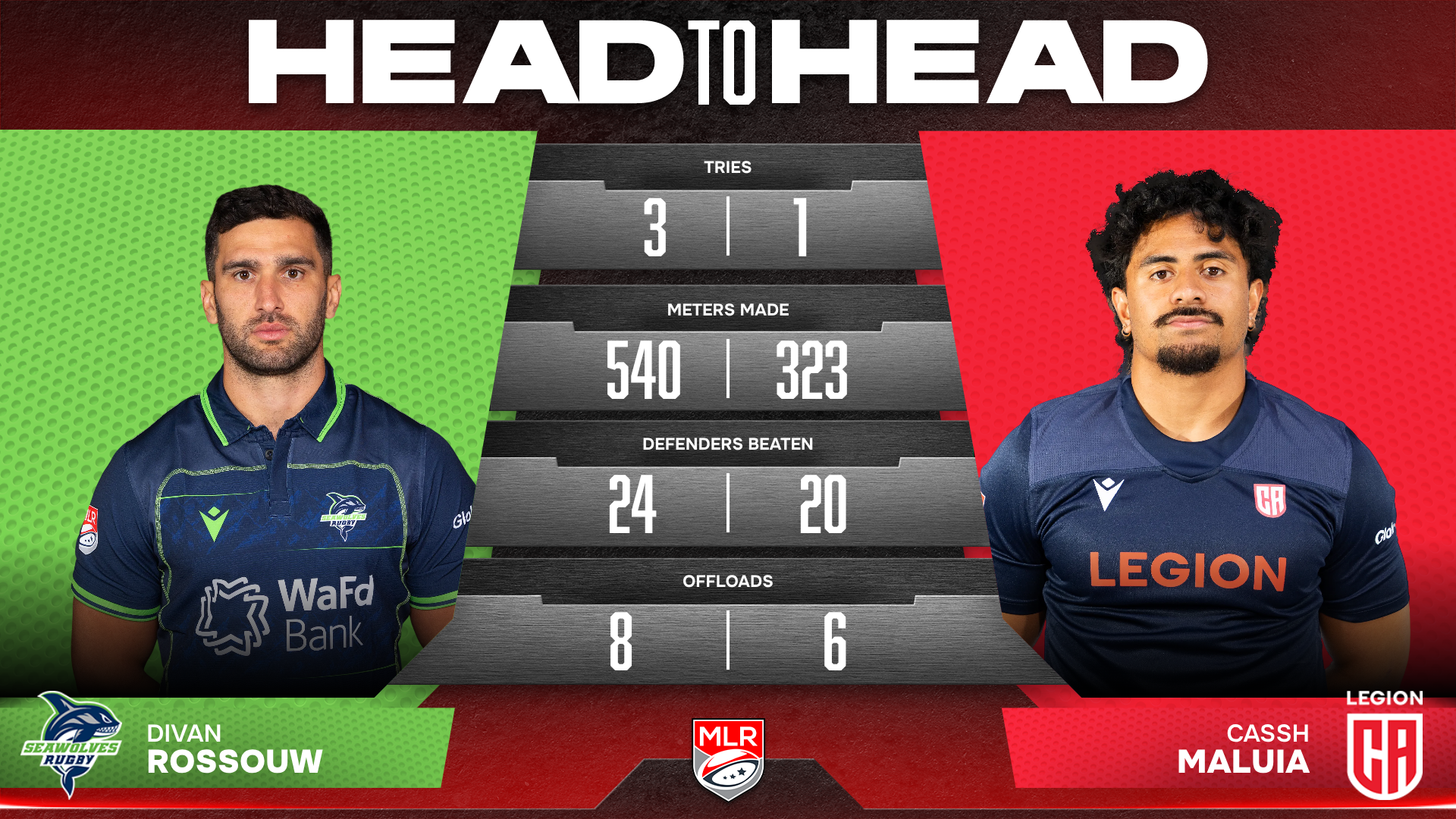
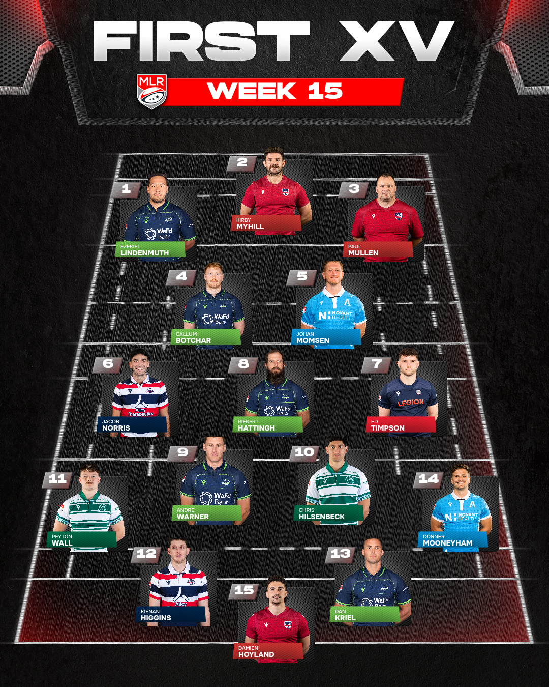
Major League Rugby needed a content suite of twenty-five graphics, ranging from a single-figure cap announcement to a full team roster of twenty-three players. Each was a bespoke layout rather than a variation on a shared grid, and each had to output at 4x5, 9x16 and 16x9. Seventy-five exports in total, with the artwork arriving as PSDs in batches over several weeks, so the system had to be built around designs that were still landing.
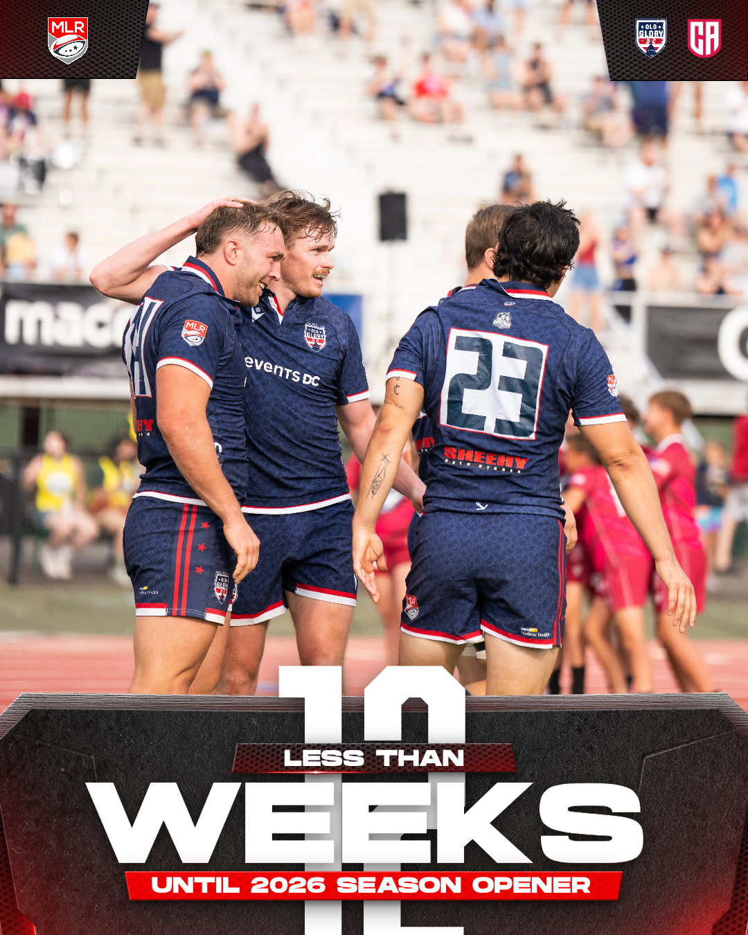
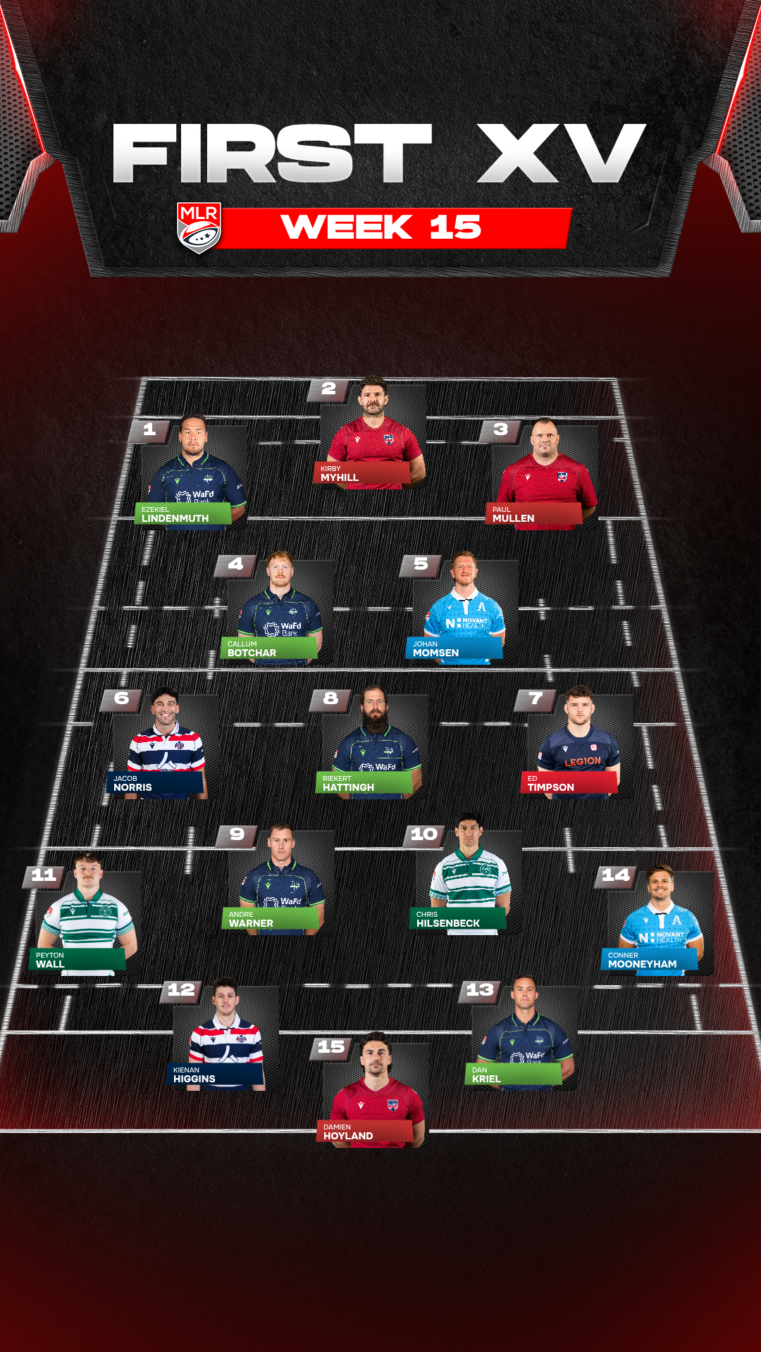
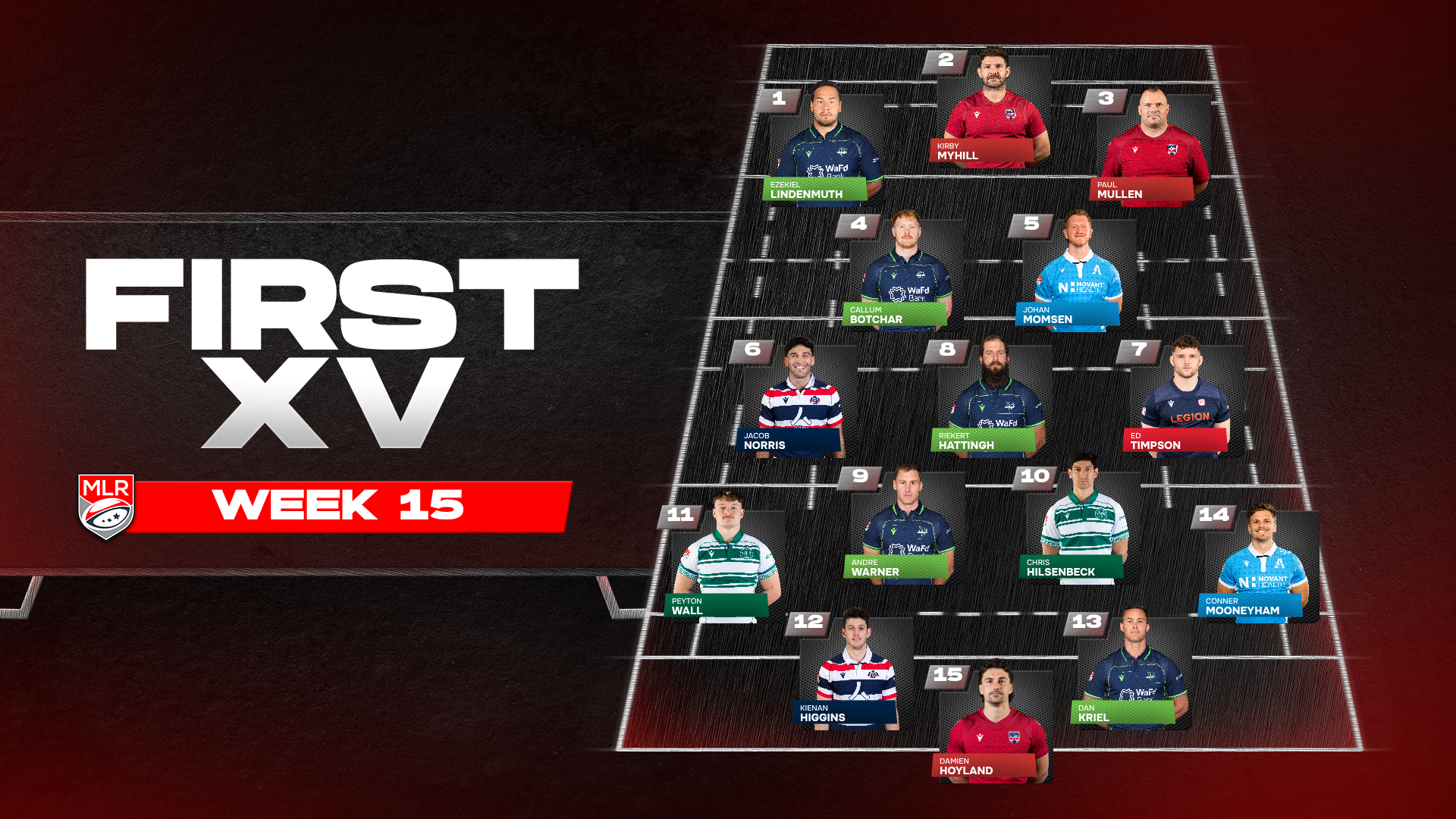
Layout values keyed to the selected ratio let one template hold three arrangements, so First XV sets its title beside the pitch in landscape and above it in portrait rather than scaling one to fit the other. A franchise selector drives colour from the chosen club, applied per element rather than per graphic, so a fifteen-player team of the week carries eight palettes at once. Absence is handled as a state too, with a no-teams option on the countdown and a league-wide variant where no club is named.
Font: Hanson, Onest, Abolition
SOFAR SOUNDS
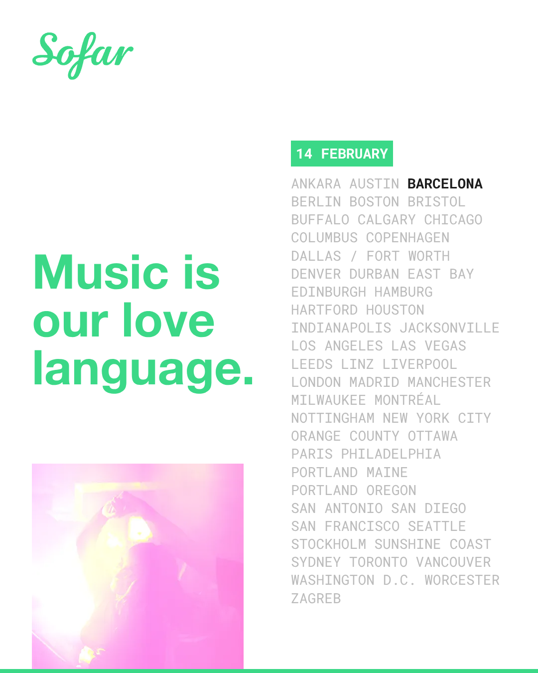
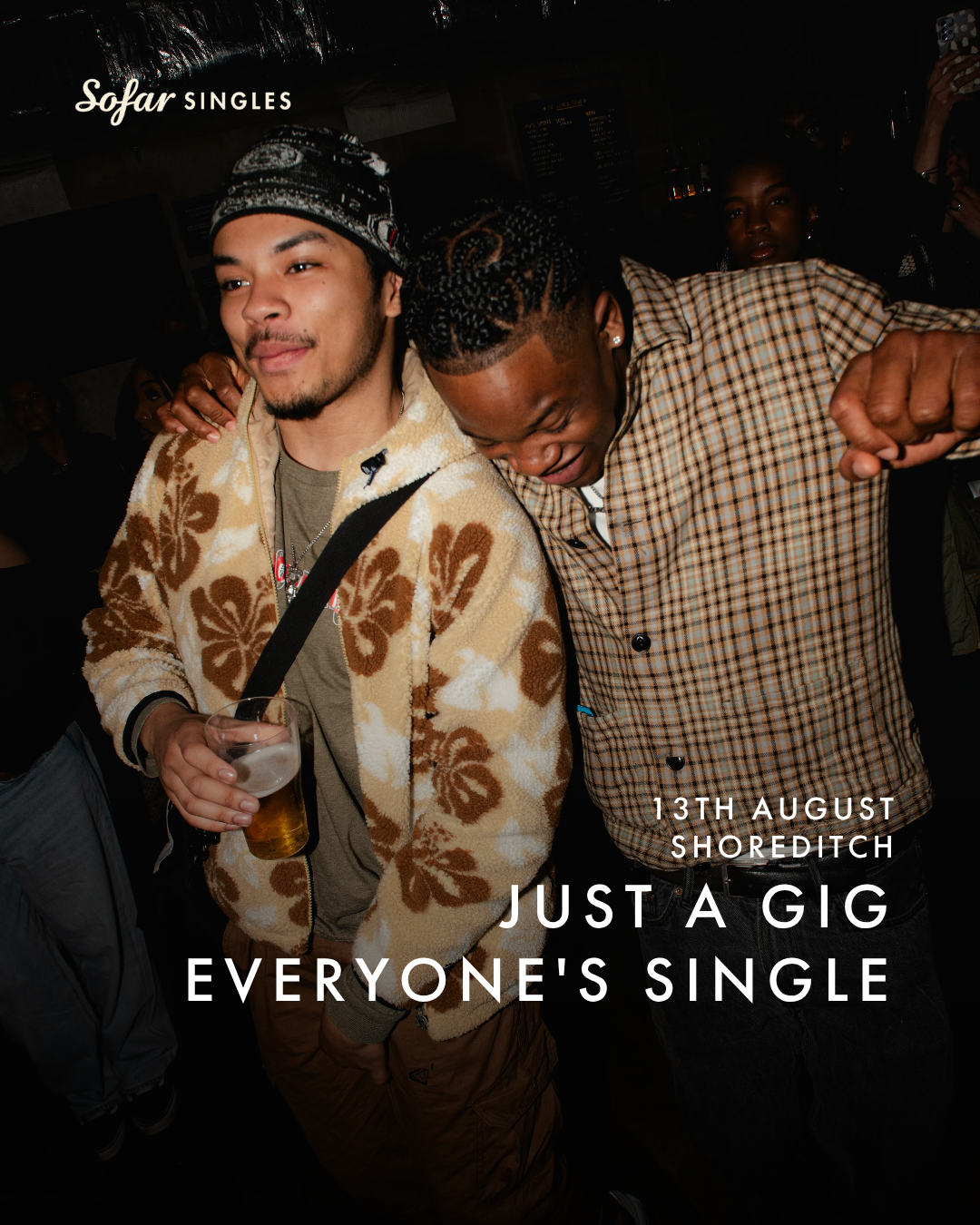
Sofar Sounds programmes intimate gigs across dozens of cities worldwide, with local producers building their own promotional assets rather than briefing a central studio. The work has grown into an ongoing suite of Formats covering covers, event listings, partnerships and seasonal campaigns, all resolving the same problem, which is how to give producers genuine control over an asset without letting the brand come apart in their hands.
Every editable element was constrained rather than left open. Producer-typed city names sit alongside the Sofar logo and shrink automatically once they exceed twice its width, a single picker recolours every dark element including the logo, and copy can be repositioned and realigned around the frame but never pushed off it. Optional gradients sit behind text where the house photography grade would otherwise render it illegible, headline copy runs from a supplied dropdown to keep the tone on-brand, and event listings expand from one entry to six. Each Format outputs at 1x1, 4x5, 9x16 and 16x9, and accepts video as readily as stills.
Font: Bely Display, Futura PT

WORLD SX
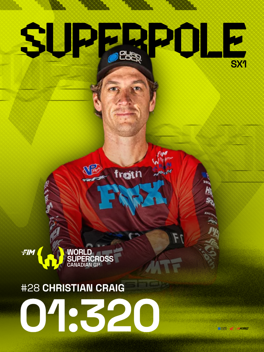
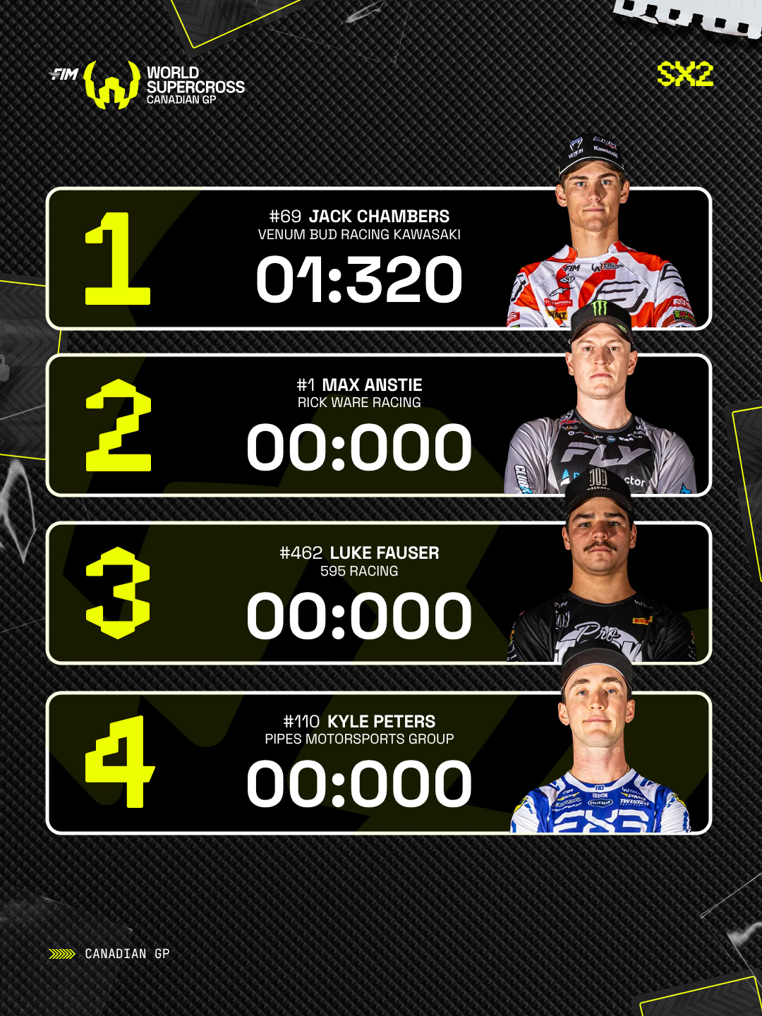
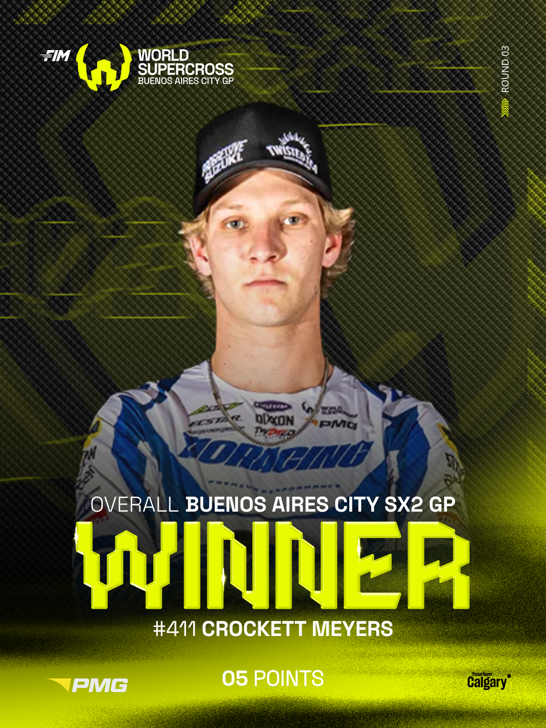
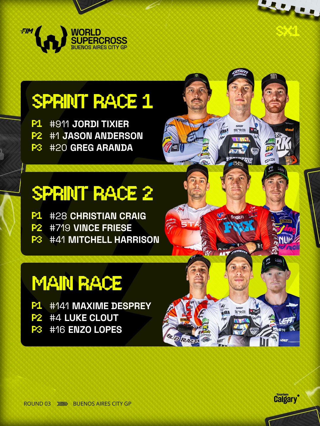
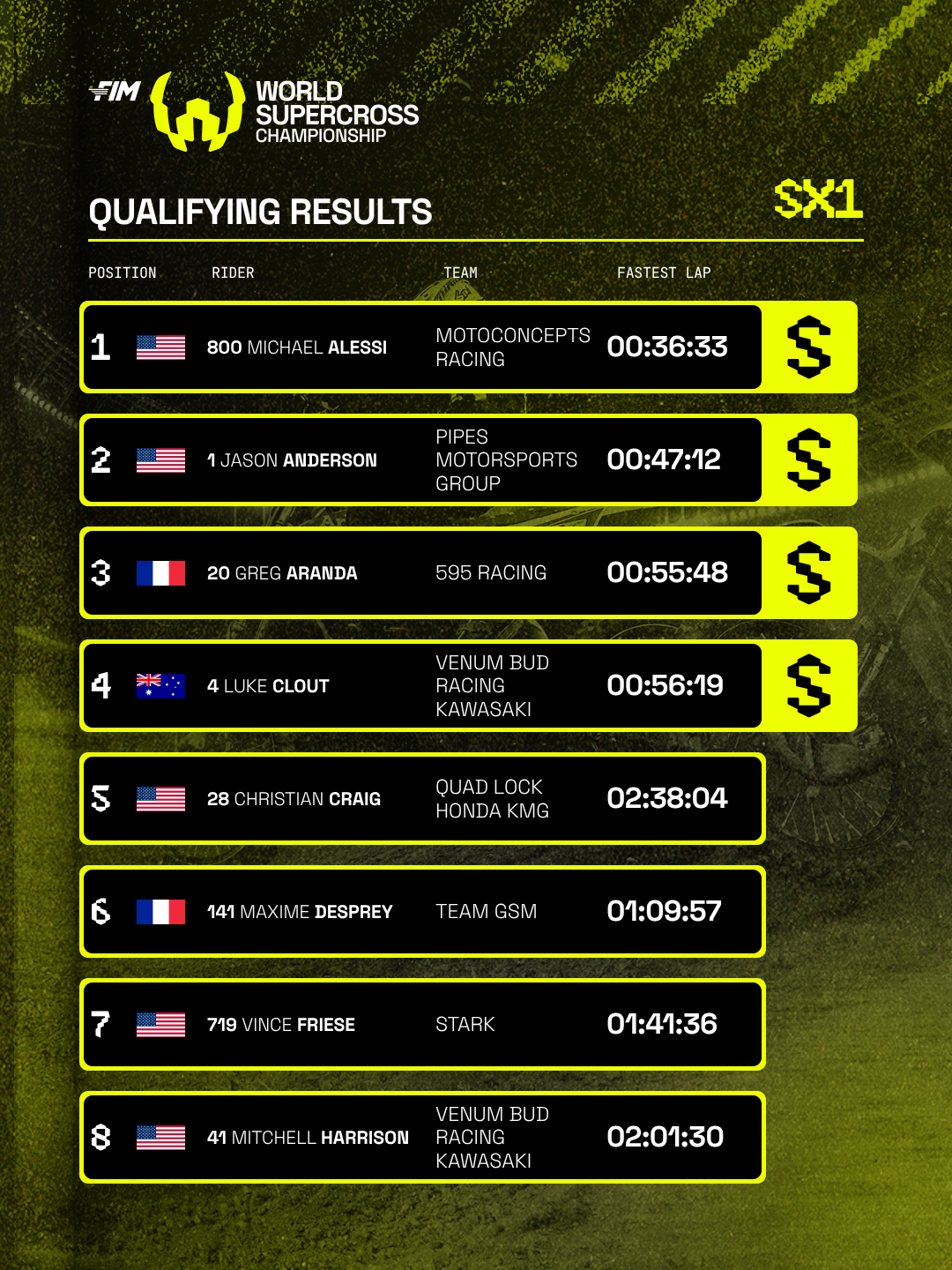
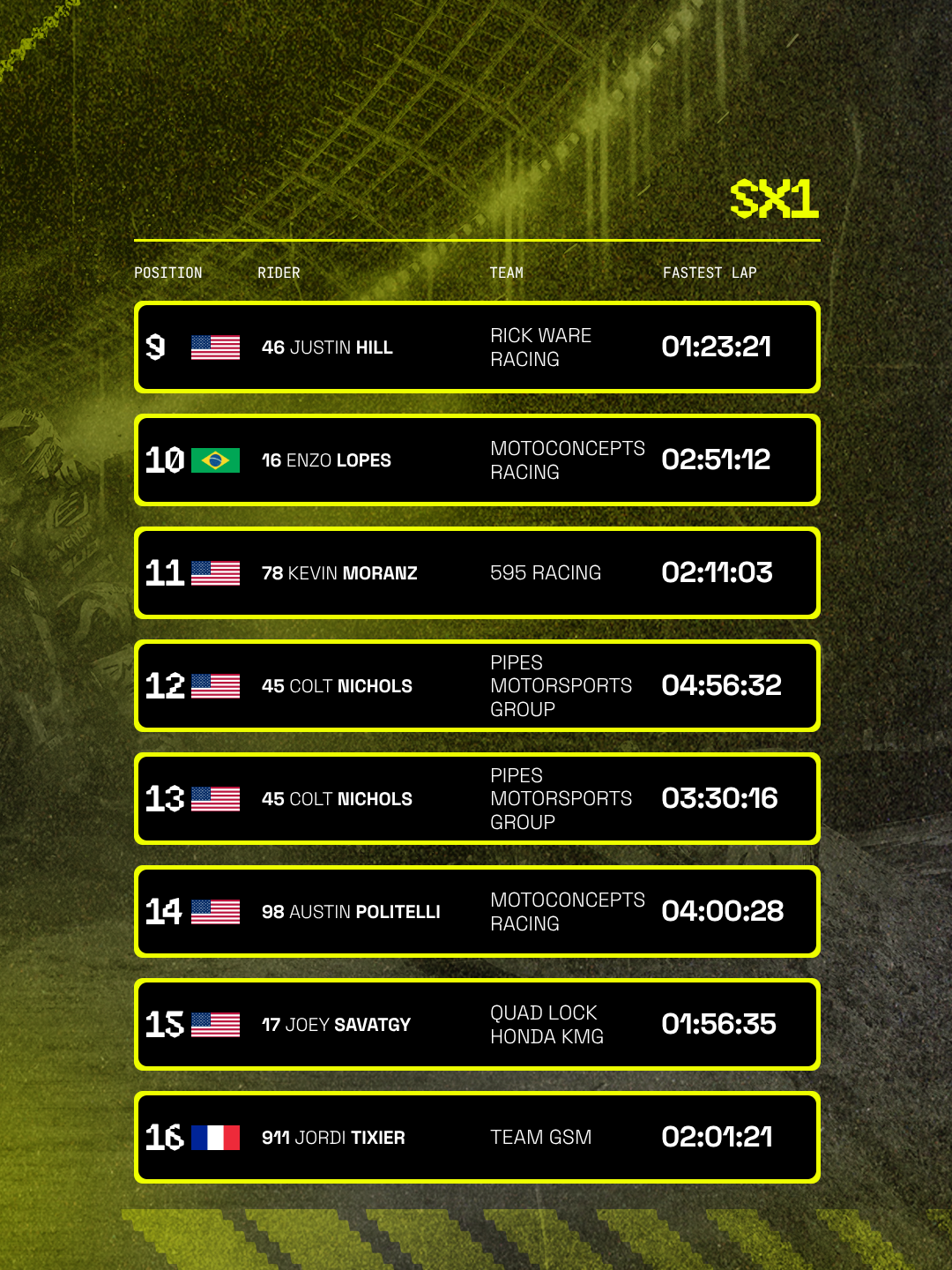
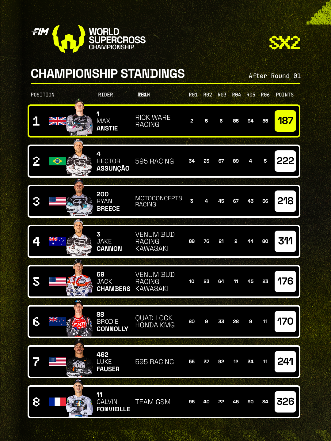
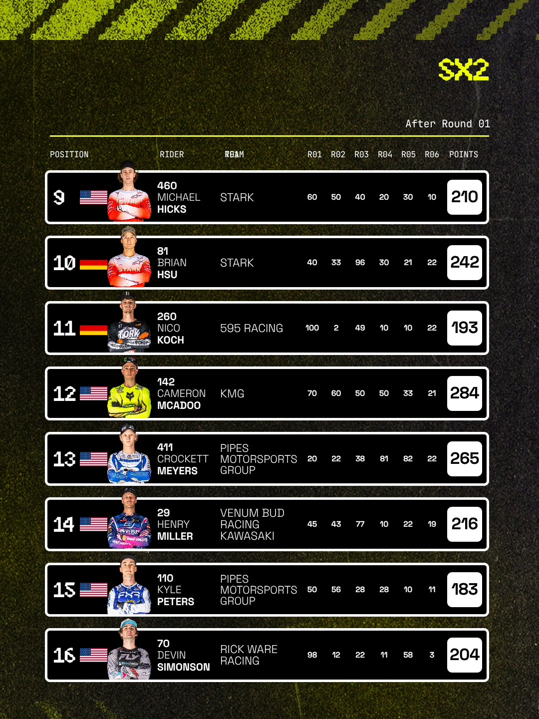
World Supercross runs two championship classes across a global calendar, and the previous season had been served by a duplicate template for every graphic, one for SX1 and one for SX2. Eight templates covered four jobs: championship standings, qualifying results, Superpole and race winners. The instruction was to carry that suite into the new season with no revised brief attached, which meant every design change would otherwise have had to be made twice.
Each pair was merged into a single Format driven by a class selector, so class now determines colour and branding rather than the choice of template. Standings and qualifying run as carousels of eight riders a slide, the second dropping the masthead so the pair reads as one post. Superpole and Winners each hold two states in one template, a single-rider hero or a fuller frame of the top four times or all three podiums, with cutouts crossing panel edges resolved through paint order.
Font: Canvas Sans, Space Grotesk