GREEN HORIZONS
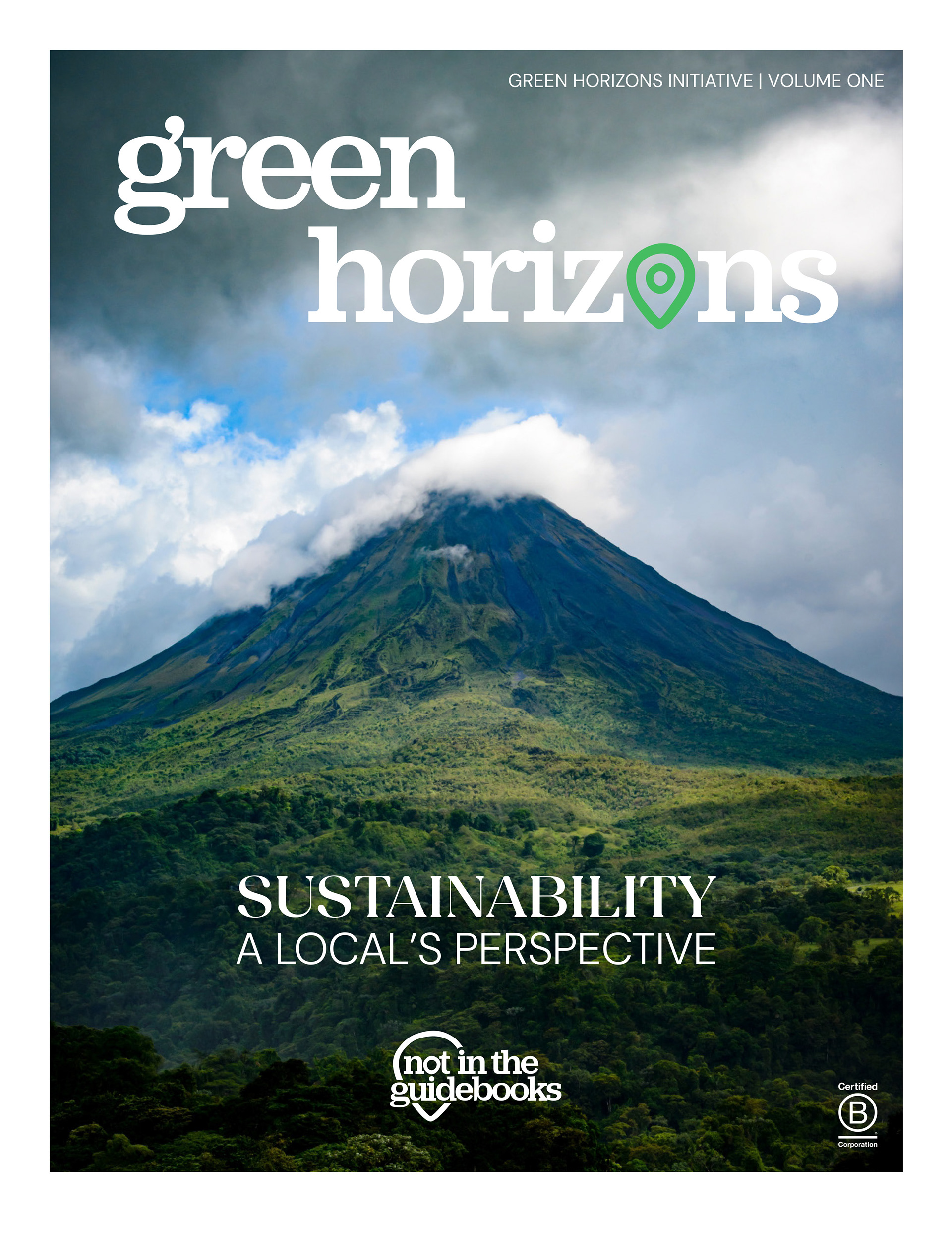
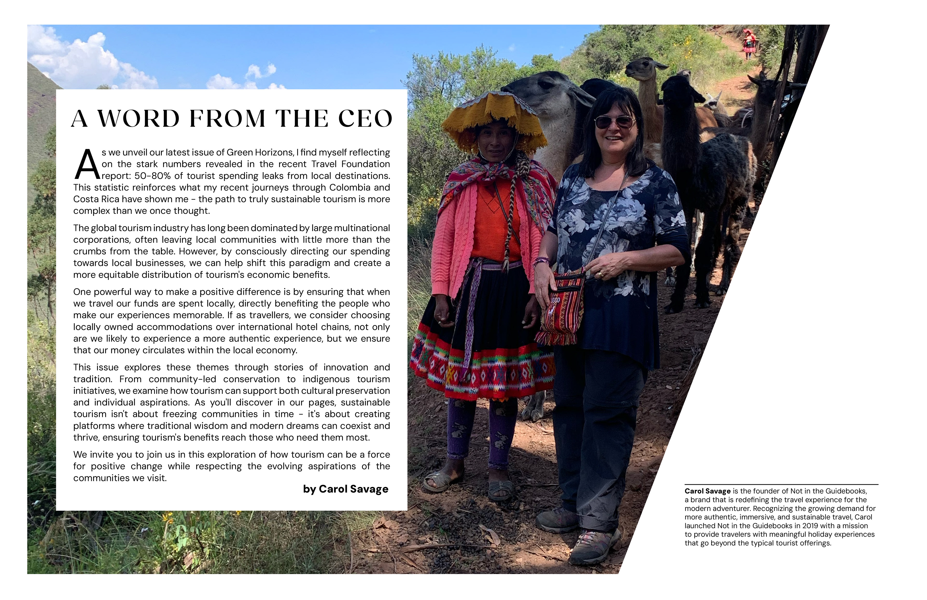
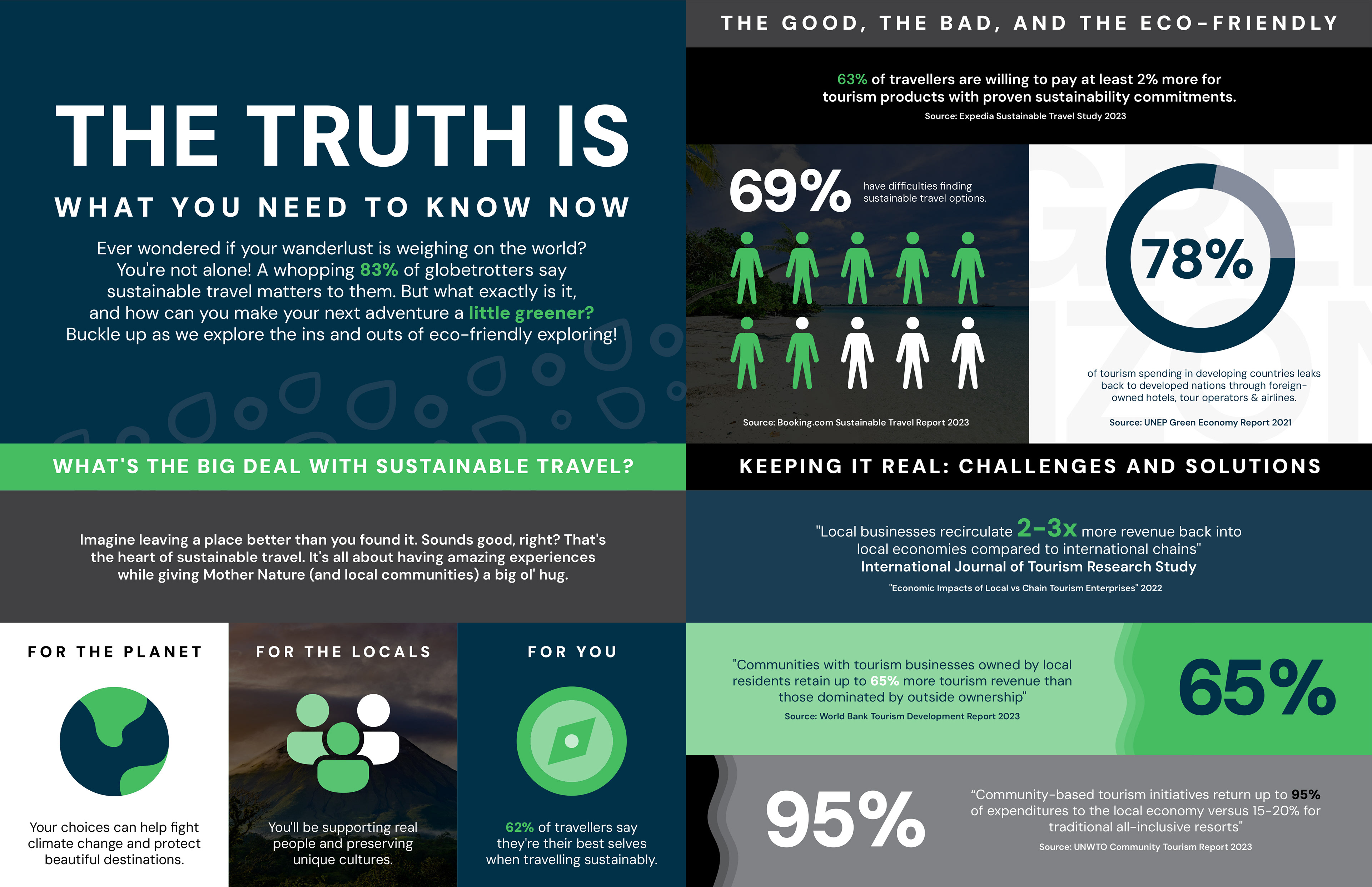
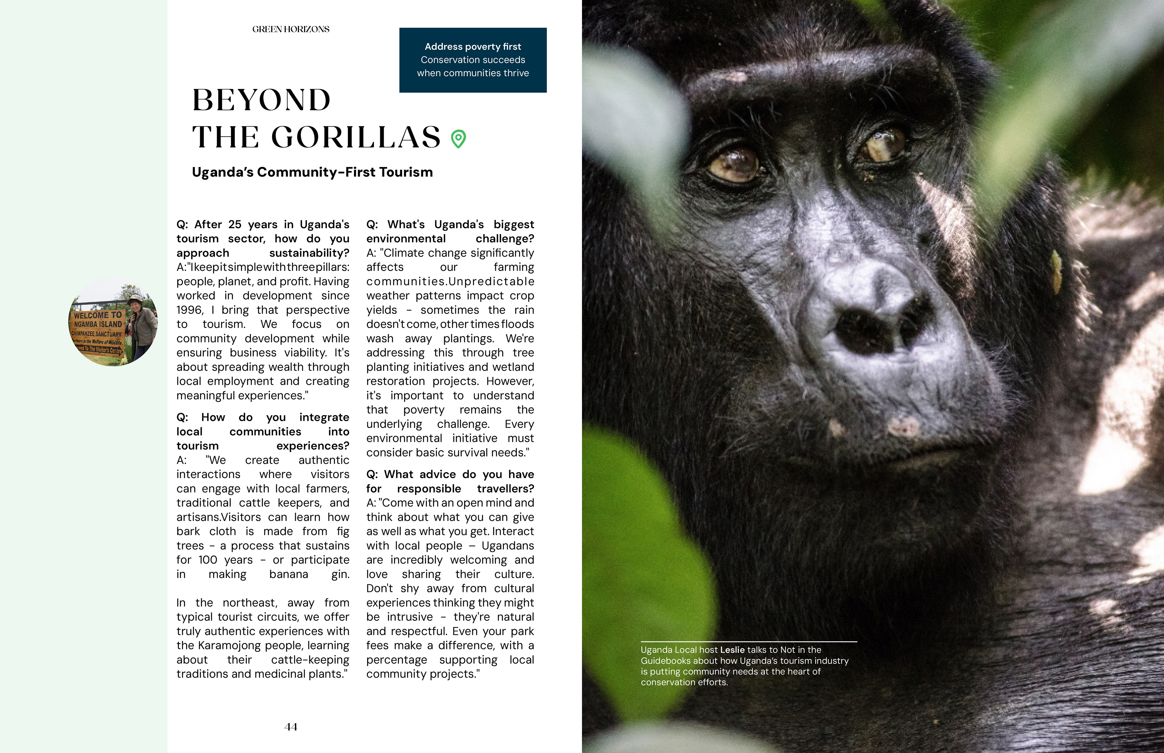
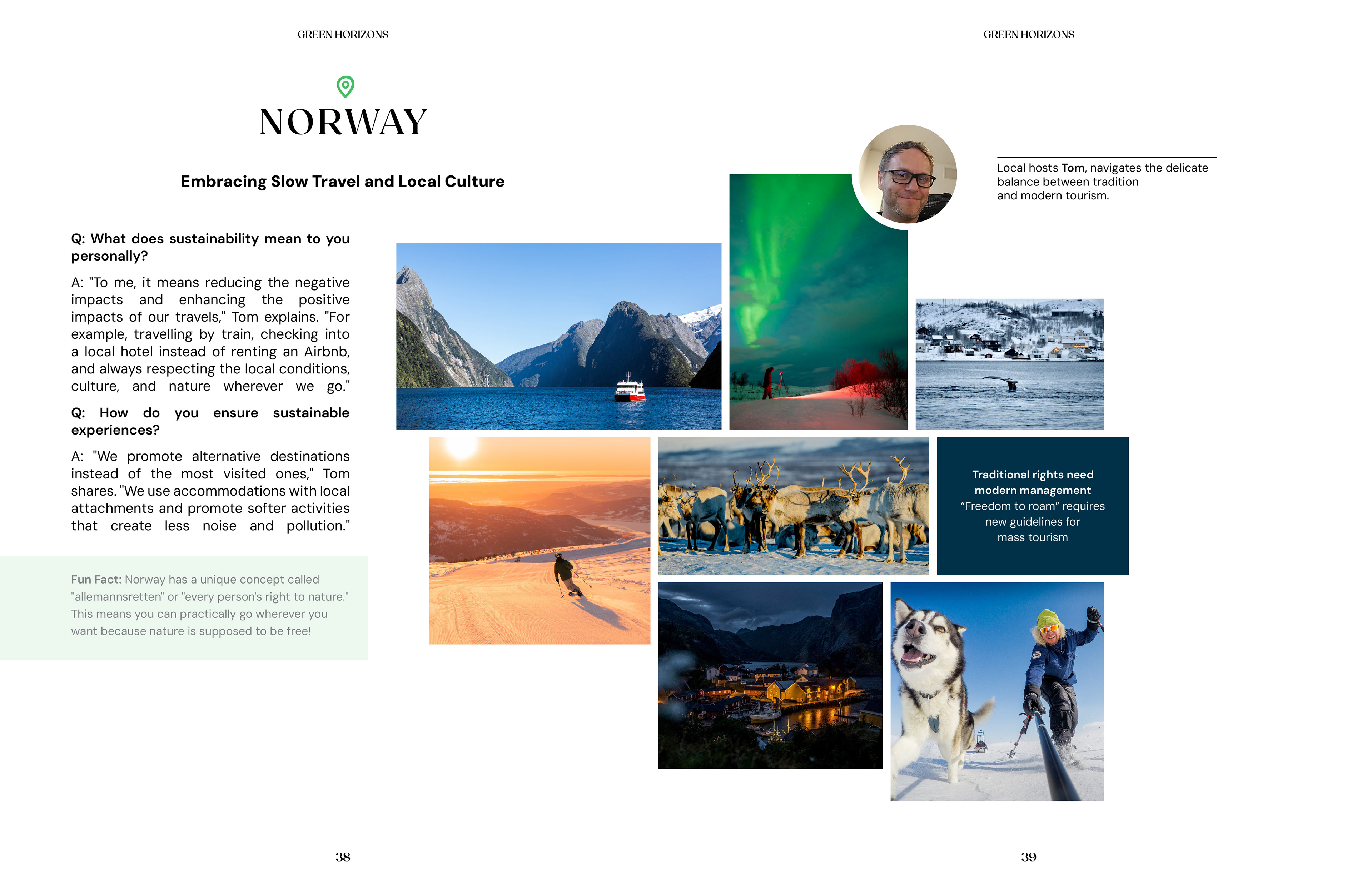
Green Horizons is Not In The Guidebooks' sustainability initiative, launched in October 2024 to educate agents and travellers on responsible travel through the voices of local hosts. Volume One of the magazine formed the centrepiece, supported by an infographic and a set of animated logo sequences for the campaign film.
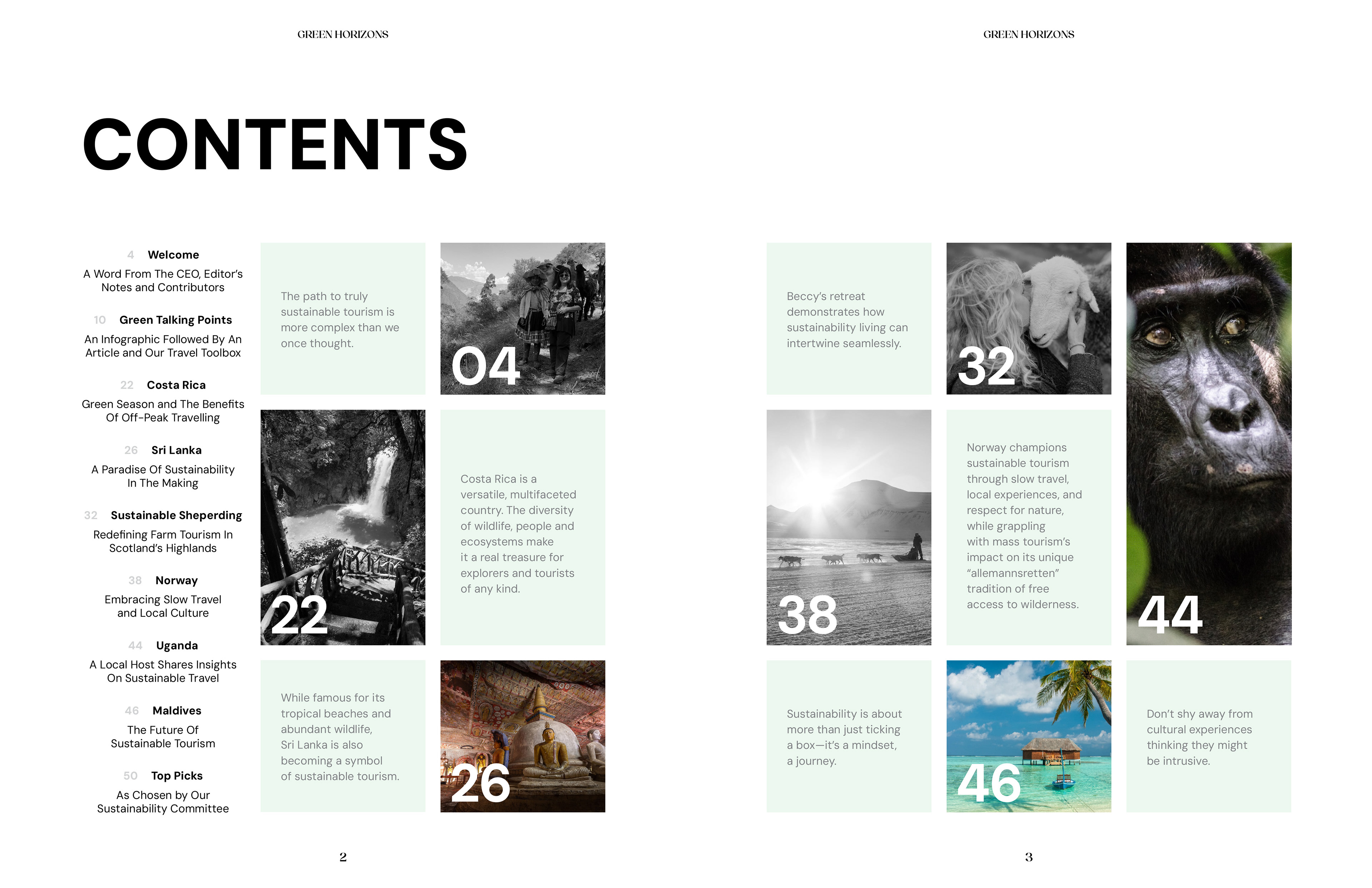
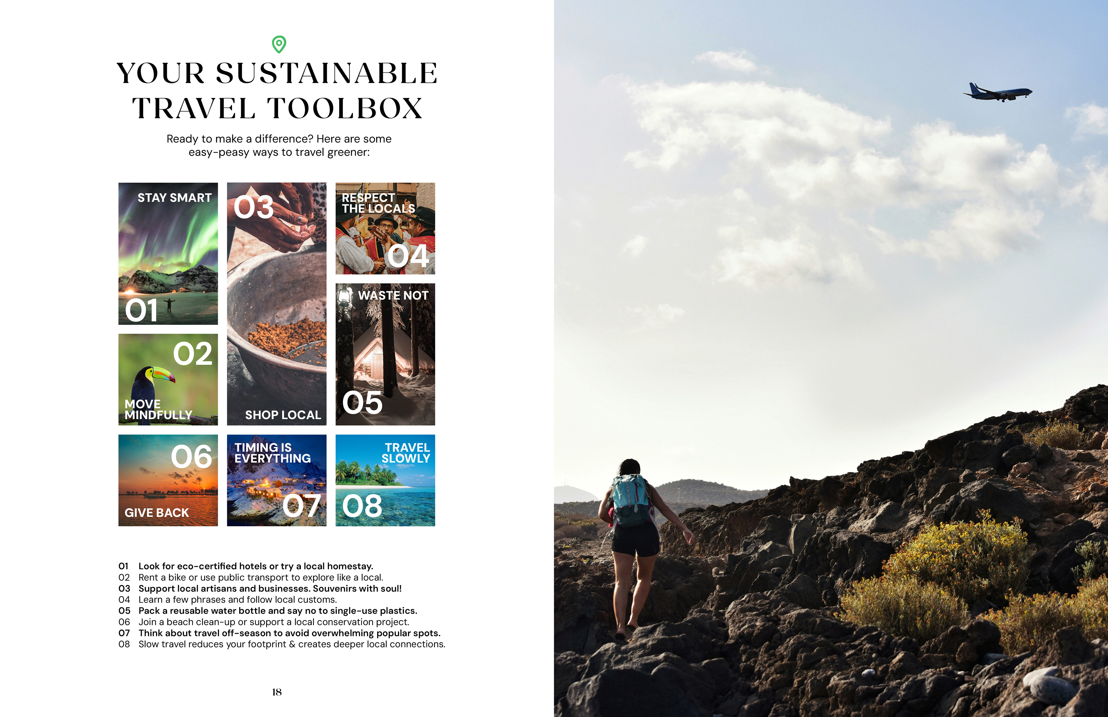
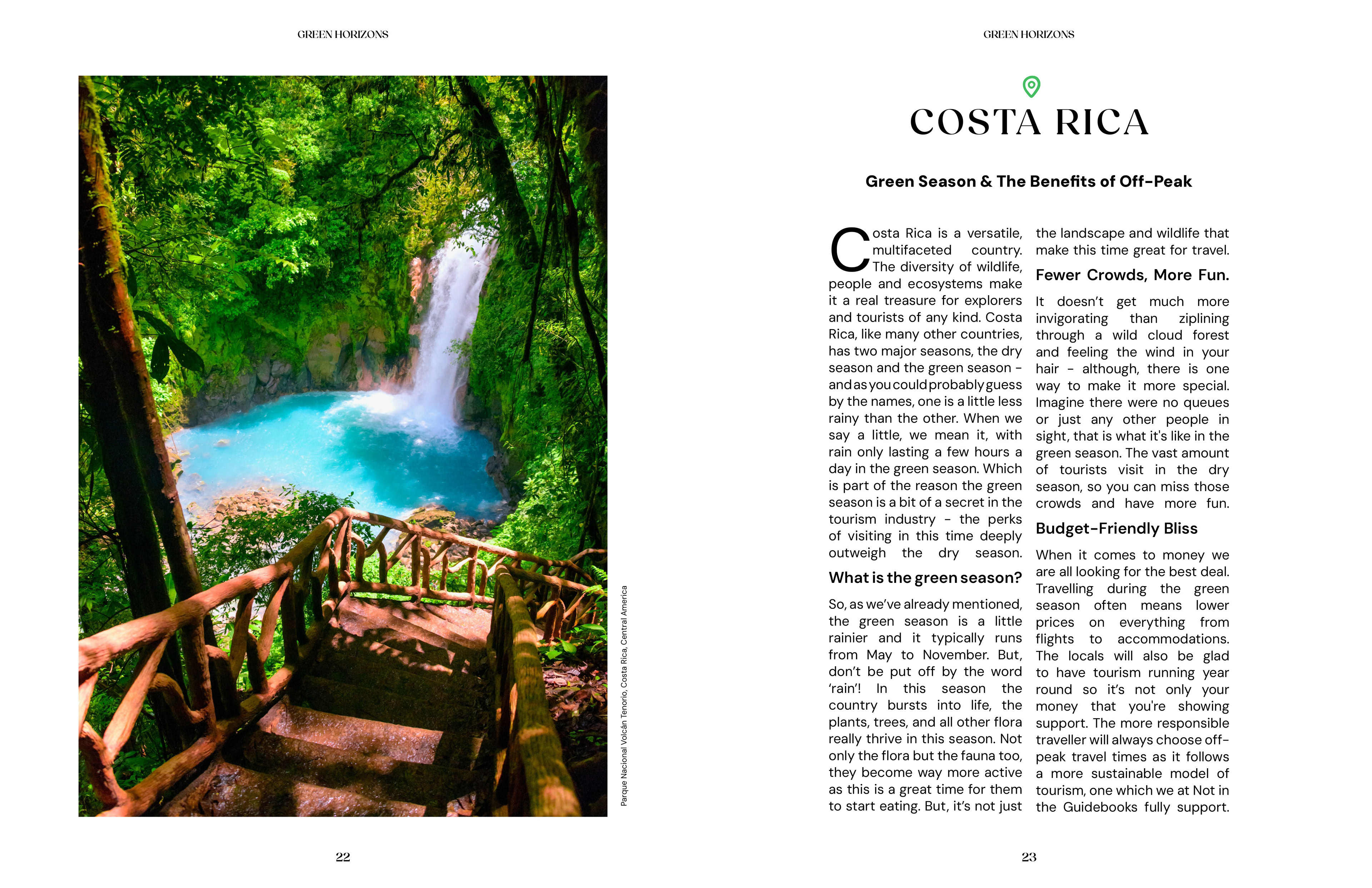
Working to a table of contents supplied by the editorial team, an editorial system was built to hold interviews, destination features, expert commentary and data across twelve countries: green panels for talking points, a pin marking every destination heading, and image grids sized to let host photography breathe. On the cover, and again in the animated intro/outro, the pin replaces the "o" in horizons, echoing the same substitution in the parent logo.
Font: Fields, General Sans
BRAND LAUNCH
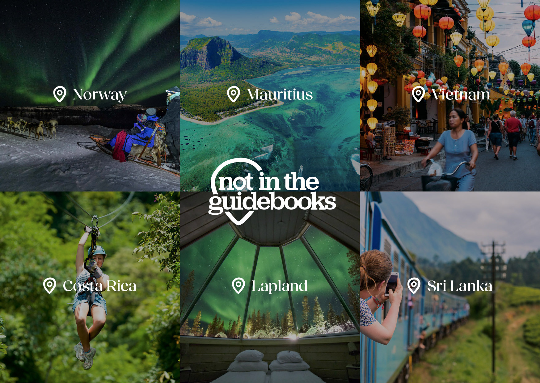
Following a rebrand, Not In The Guidebooks needed a launch toolkit inside a single week: three pull-up banners, a double-sided A5 flyer, and an About Us video. The pin taken from the logo became the organising device across all of it, serving as image mask, bullet point, location tag and QR container in turn.
Banners alternate between the pink and navy colour ways, each carrying a headline built from the brand name, average, ordinary, typical - while the flyer reverses into a six-destination grid with the logo sitting at the point where all six meet. Print was set in InDesign; the video was assembled in Premiere Pro with motion graphics animated in After Effects.
Font: Fields, General Sans




RACE AROUND THE WORLD
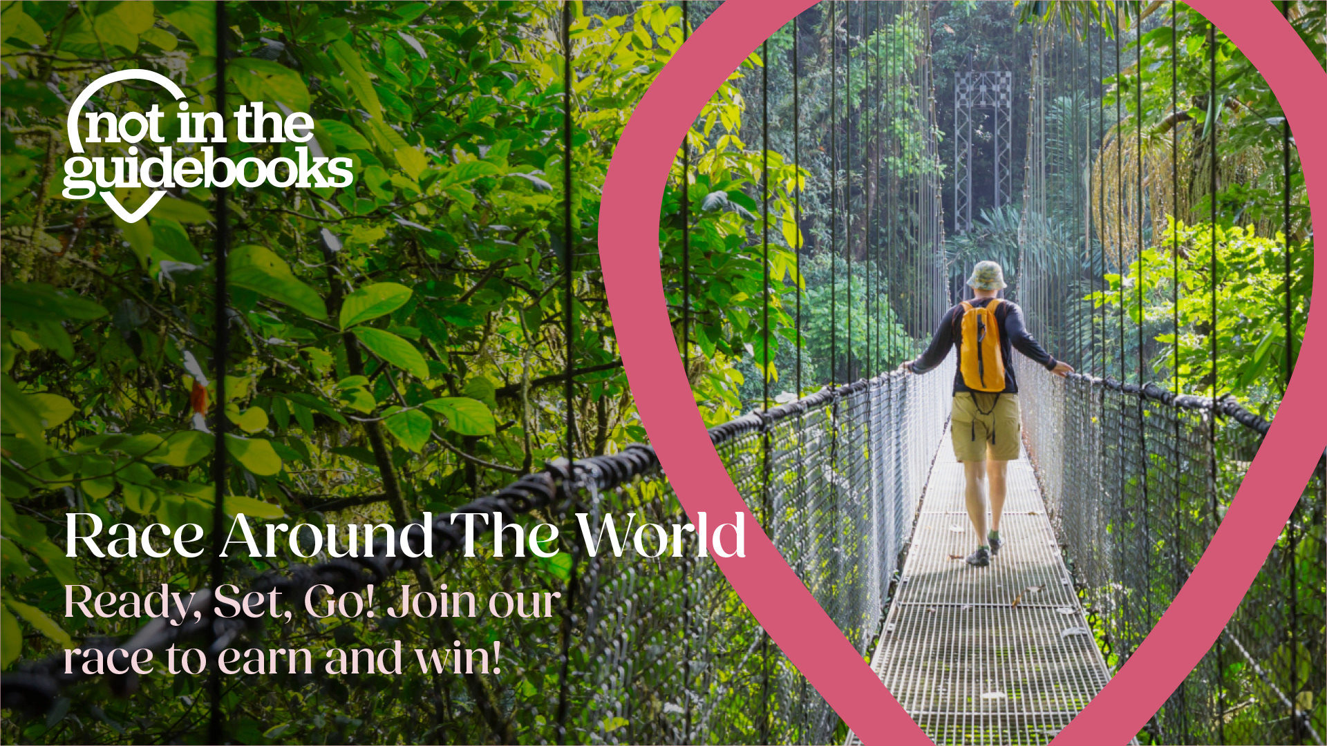
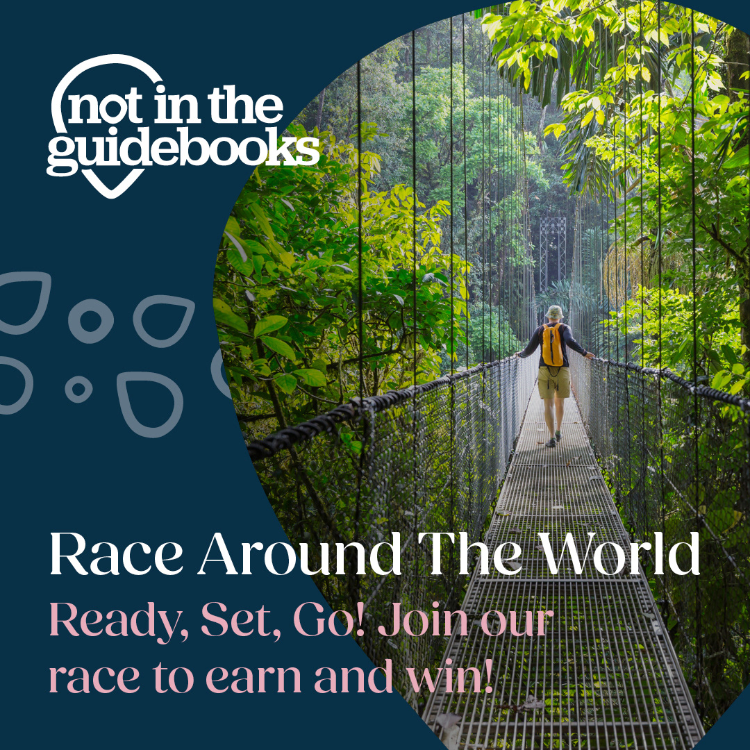
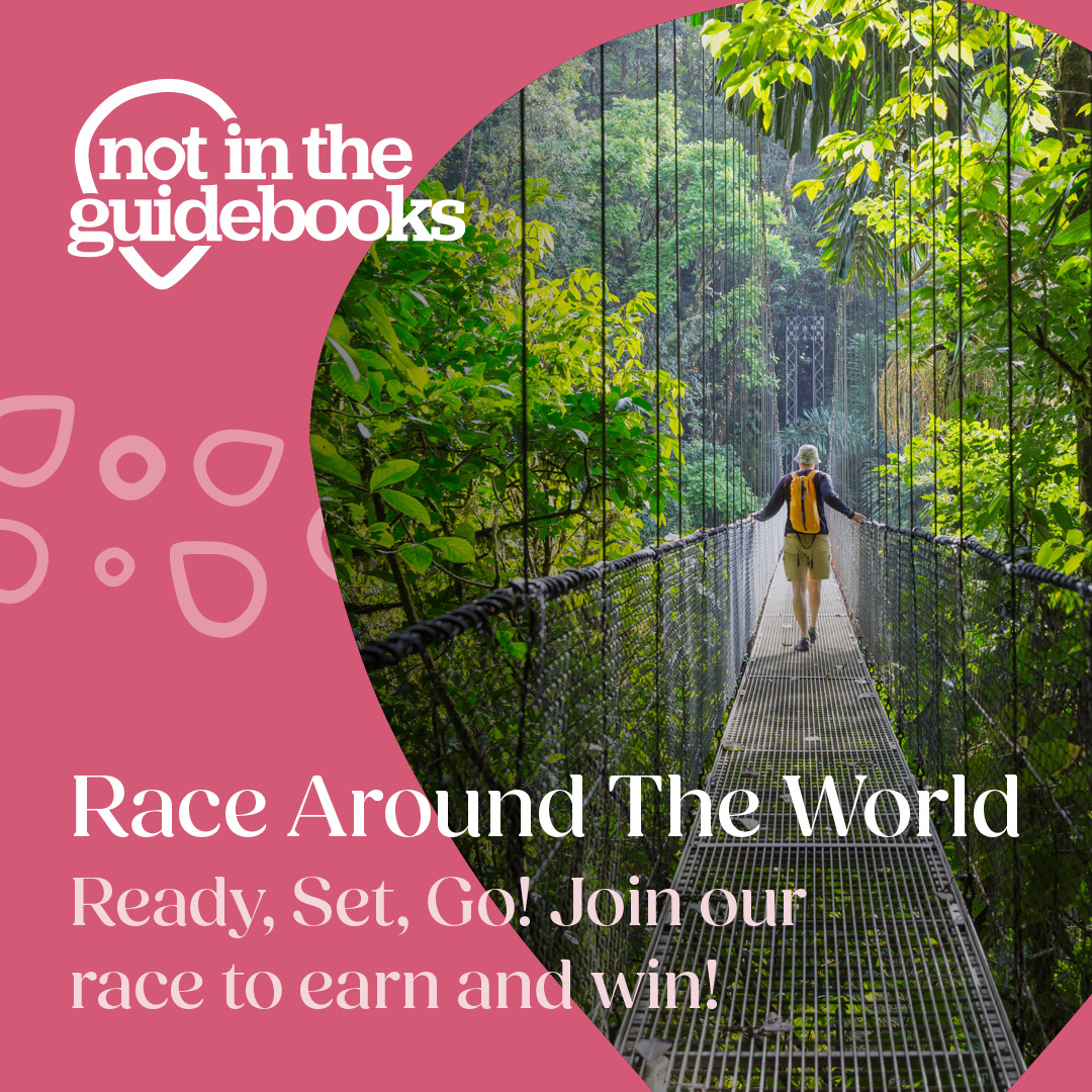
Race Around the World was a trade incentive running in Q1, rewarding travel agents for bookings made during the campaign period. The full set was briefed and delivered inside a week, covering a website and email header, two social posts, a vertical reel and an email signature.
An early layout proposal was carried through the whole set, a pin-shaped mask holding the photography off to one side and leaving the opposite half clear for copy, adaptable to any image the client later selected. In the reel the same shape animates, scaling in as a solid form, arcing across footage as an overlay, then expanding to full frame to wipe between prize cards. Three alternative end frames were supplied so the client could settle the balance between logo and slogan.
Font: Fields, General Sans