LISTERINE
Agency: THE BANNERMEN
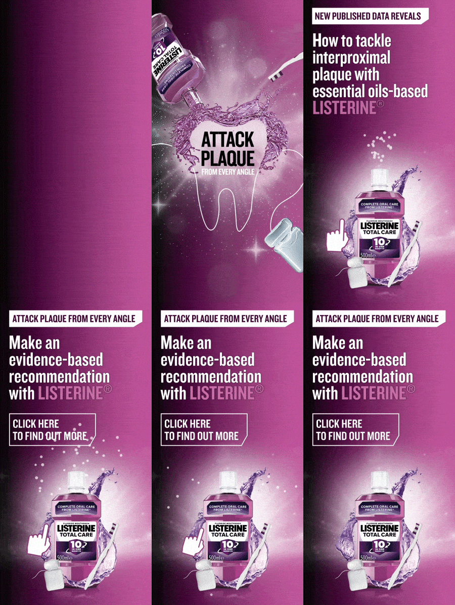
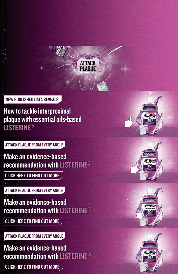
In this campaign, it was necessary to include the copy and animation in all of the banner resizes. To meet this requirement, multiple design options were presented to the client, allowing them to make an informed decision.
For the landscape dimensions, a larger gradient was implemented to maximize the visibility of the copy against the captivating animation, ensuring a balanced and engaging design.
Font: Knockout, VAG Rounded


SNAPCHAT
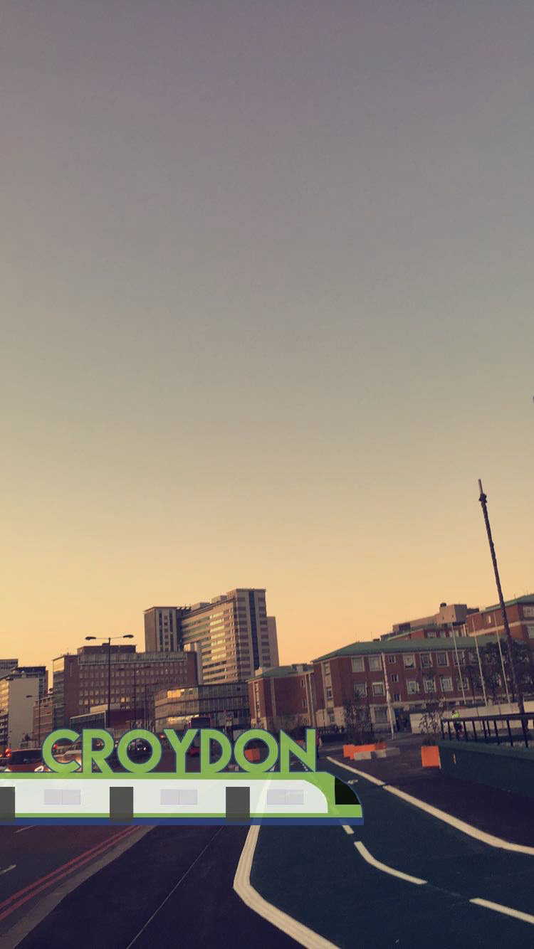
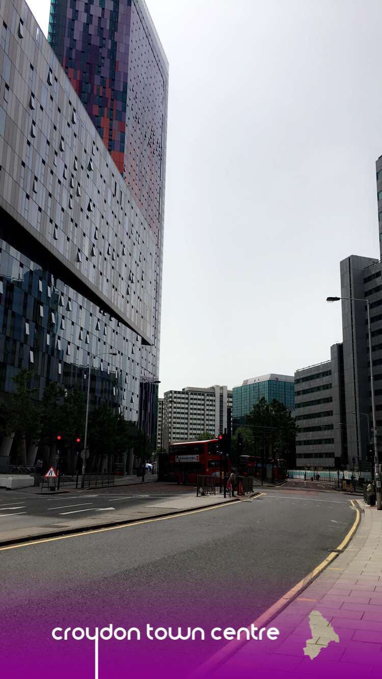
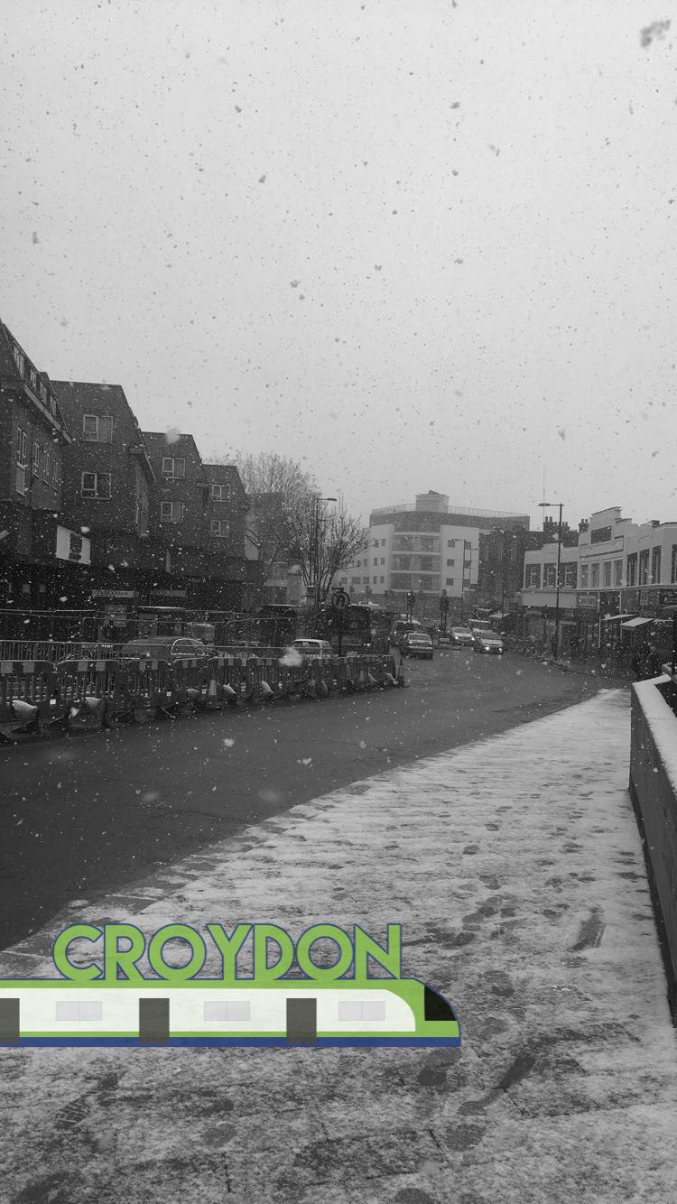
During the increased use of geo-location filters, designers were given the opportunity to create some for their local area. The primary source for inspiration was the branding of Croydon Tramlink, as it holds strong association with the local area of Croydon.
Image 4 was the initial concept, but after research into other banners that were mainly typography based, the iconic tram was integrated underneath the copy to be unique amongst the other filters. Image 7 was approved for use the following year, with both filters still in use till this day.
Font: Lemon Milk, Smooth Circulars



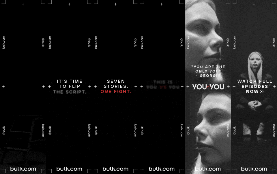
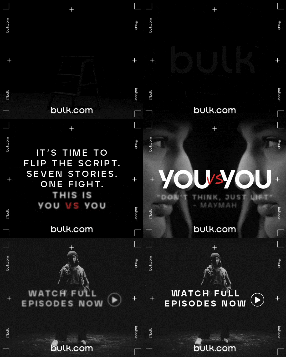
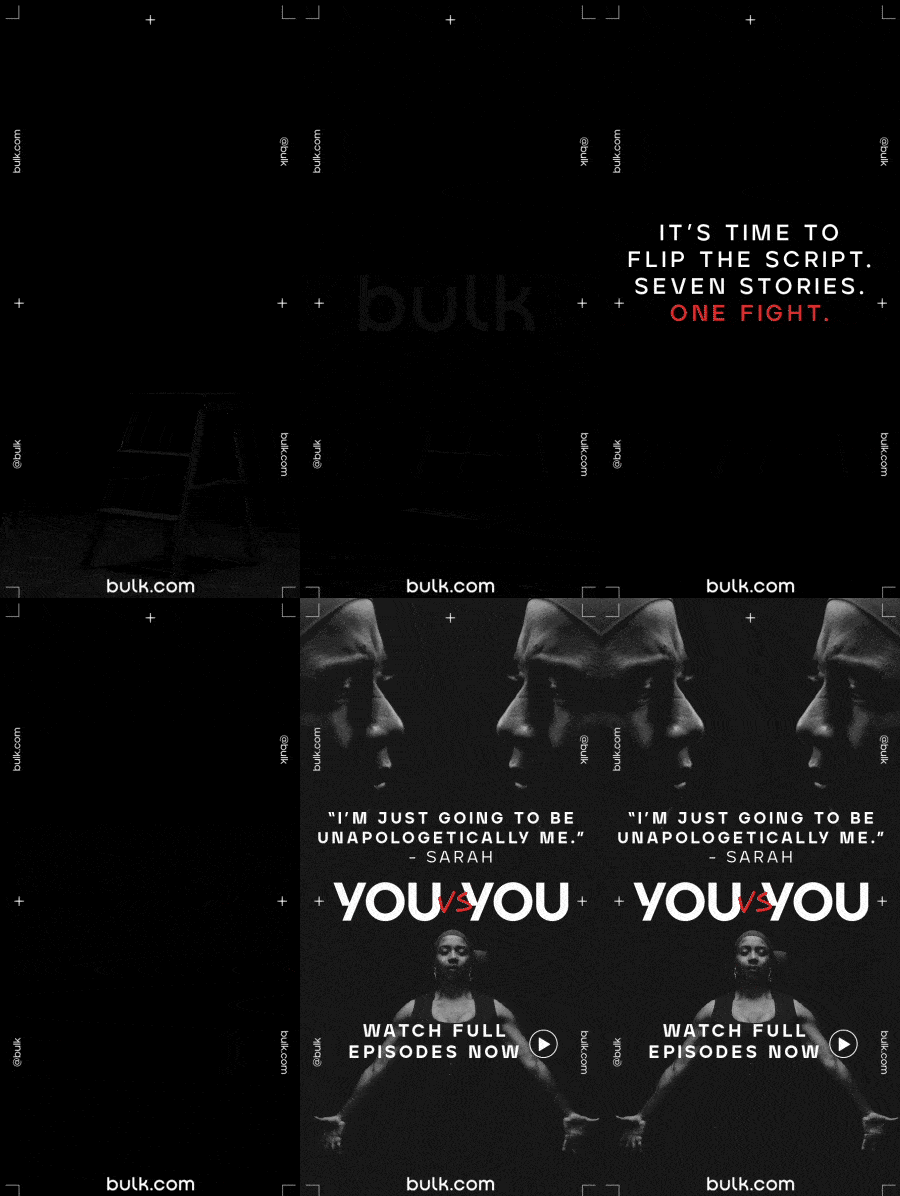
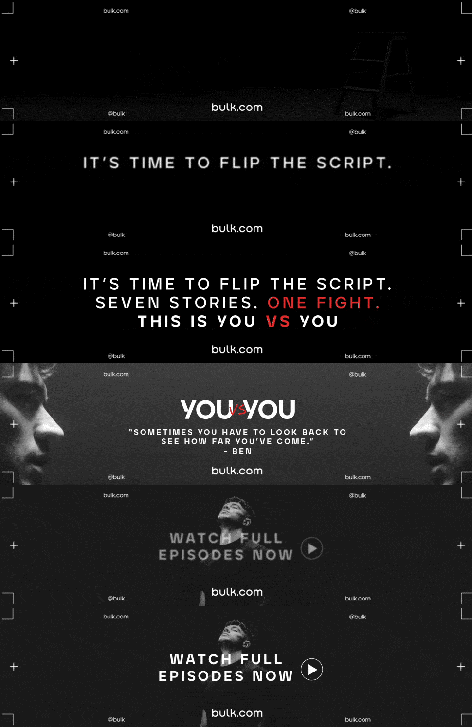
BULK
Agency: THE BANNERMEN
The production team had the responsibility of creating 20 designs in total, consisting of 5 resizes for 4 different versions. To streamline the process, the 300x600 (DMPU) size was chosen as the reference point due to its adaptability to other sizes.
After finalizing and obtaining approval for the DMPU design, the team shifted their focus to the lens layout and monotone imagery, ensuring a consistent and visually appealing aesthetic throughout the designs.
Font: Bulk Sans