EMPOWERHER
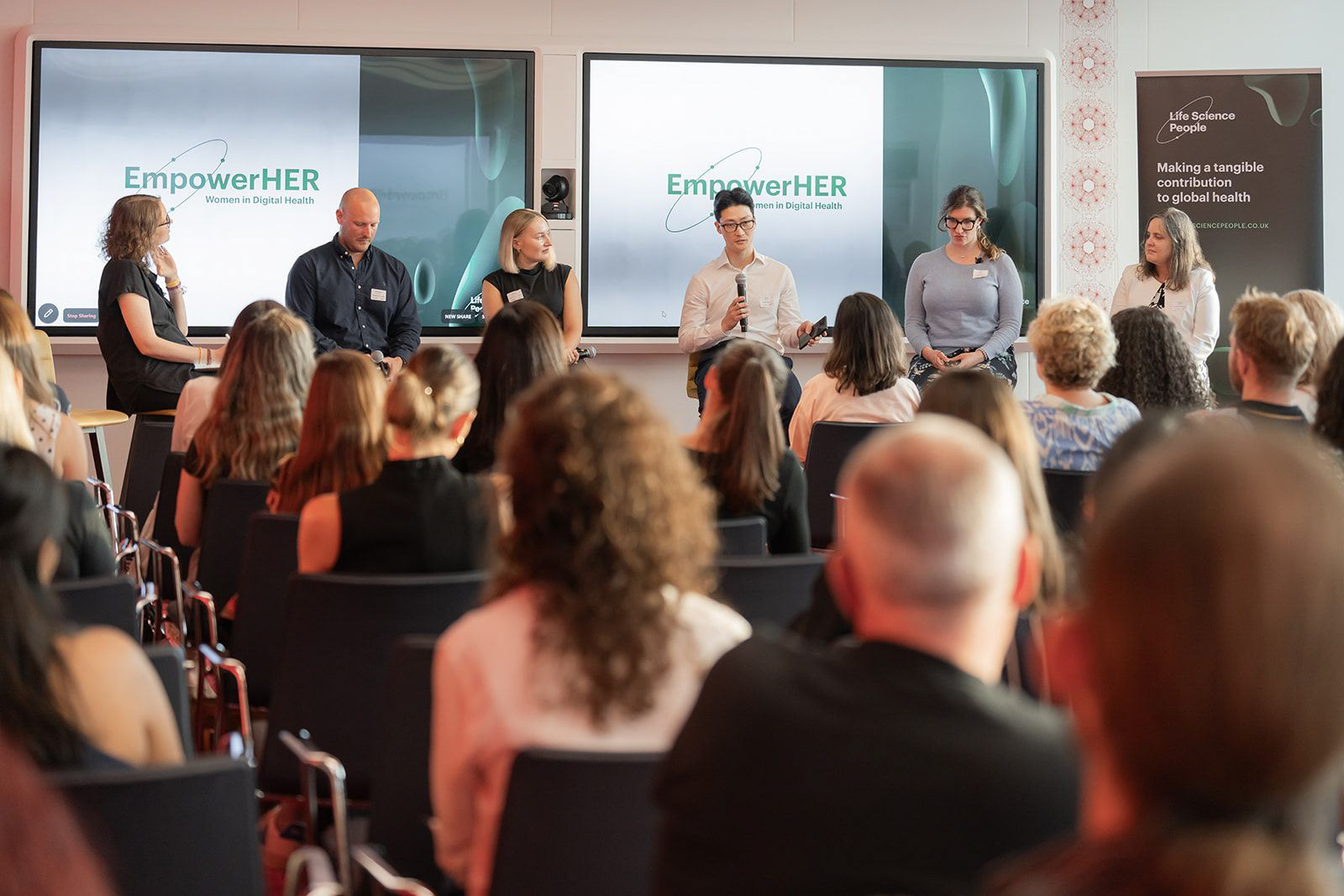
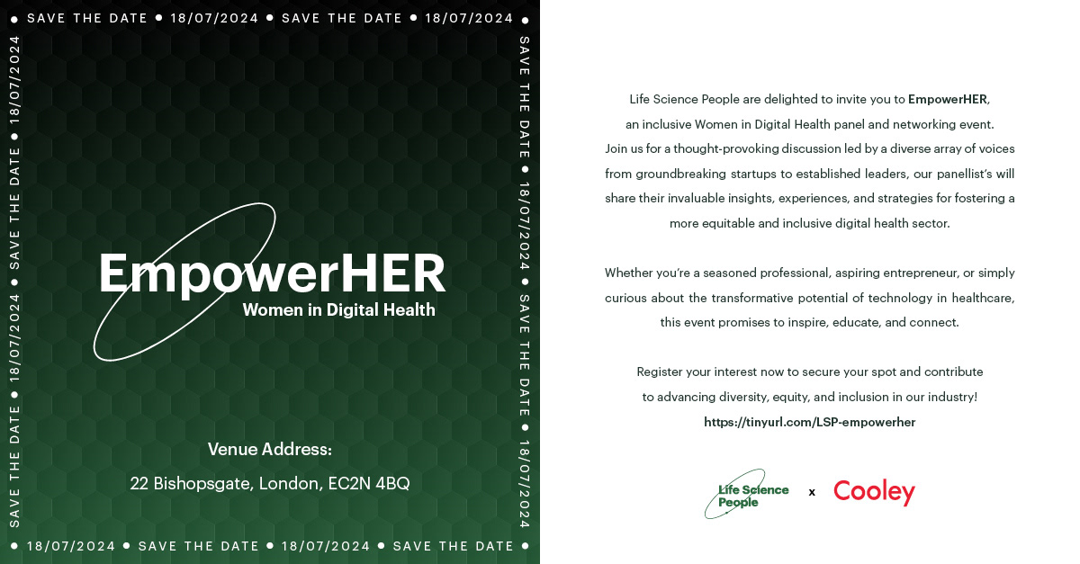
EmpowerHER, a Women in Life Sciences panel and networking event, needed an identity that could sit alongside the parent brand without being absorbed by it. The campaign ran across social announcements, email, and printed material for the event itself.
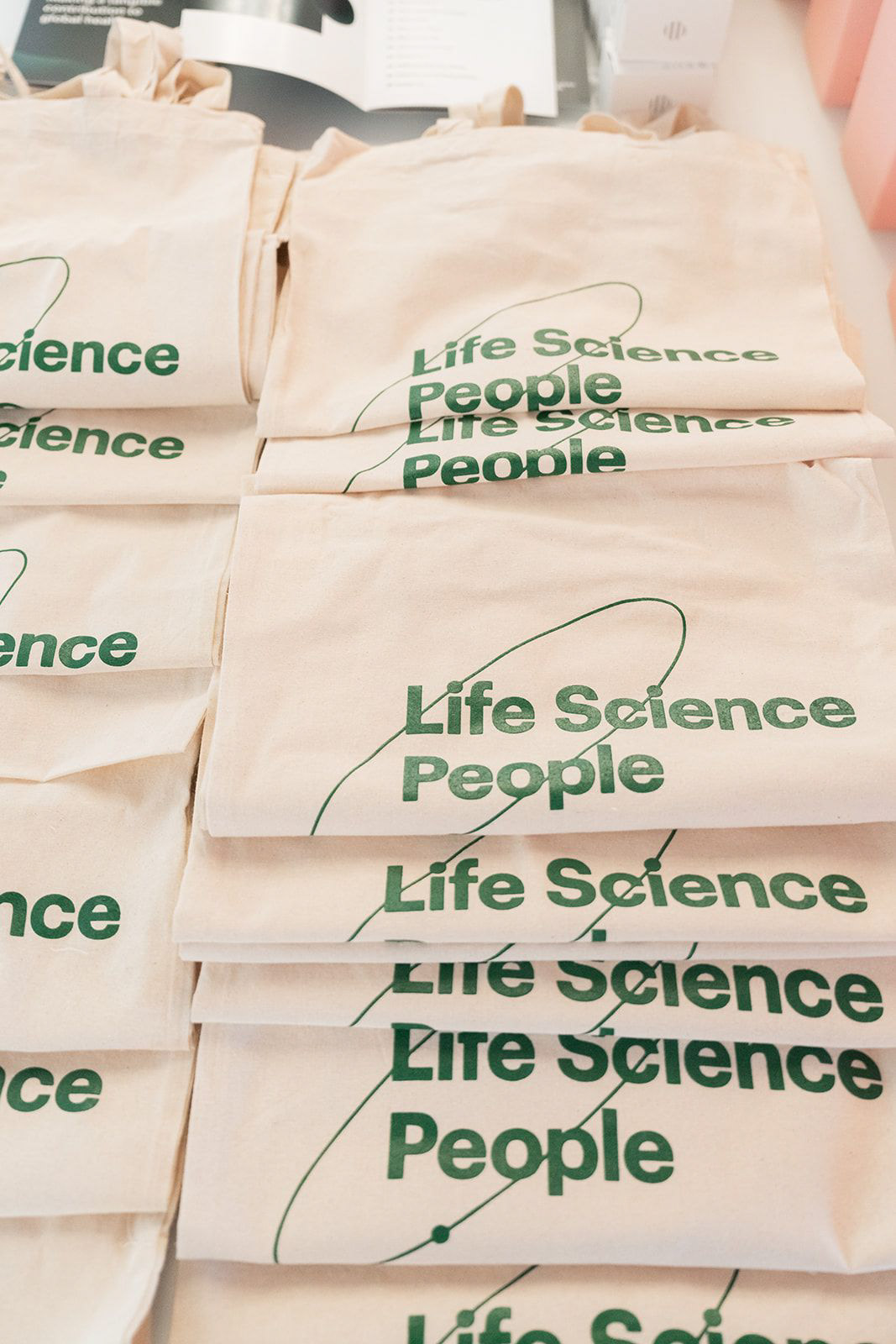
To achieve this, the existing orbit device was reworked to wrap the EmpowerHER name, retaining the link to Life Science People while giving the event its own mark. A hexagonal pattern over a deep green vignette distinguishes it from the parent brand's gradient forms, and a ticker border carrying the date runs the full perimeter of every asset - establishing a recognisable frame that holds whether applied to a square social post, a landscape LinkedIn banner, or an email header. The same system extended into the venue across pull-up banners, screen graphics and printed tote bags, with a panellist board scaling from a single portrait to a full nine-person grid.
Font: Graphik
EVP CAMPAIGN
The client set out to promote their employee value proposition to prospective consultants through a sixteen-part campaign, publishing two videos a week across eight weeks. Each week paired a designed infographic setting out career structures and timeframes with a filmed interview featuring a member of the team. The challenge was to make two very different content types read as a single campaign.
Each stage of the career path was given its own full-frame card, numbered and paired with an expected duration, alternating between white and pale green so the progression is felt as much as read. The interviews were shot on iPhone 14 Pro and edited in Premiere Pro and After Effects, captioned throughout for sound-off viewing and framed square to match. An animated brand ident opens and closes every video in the run, tying both strands together.
Font: Graphik
BROCHURES
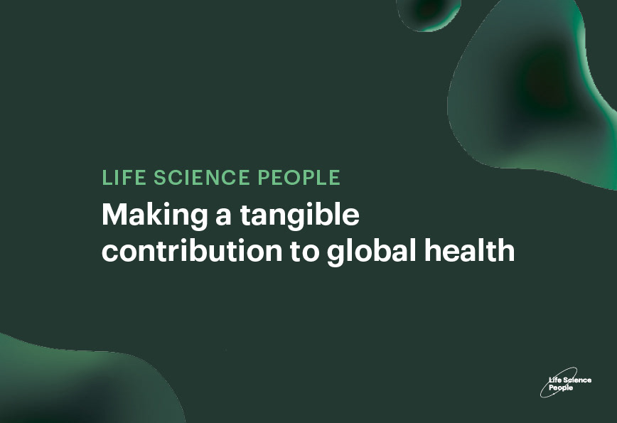
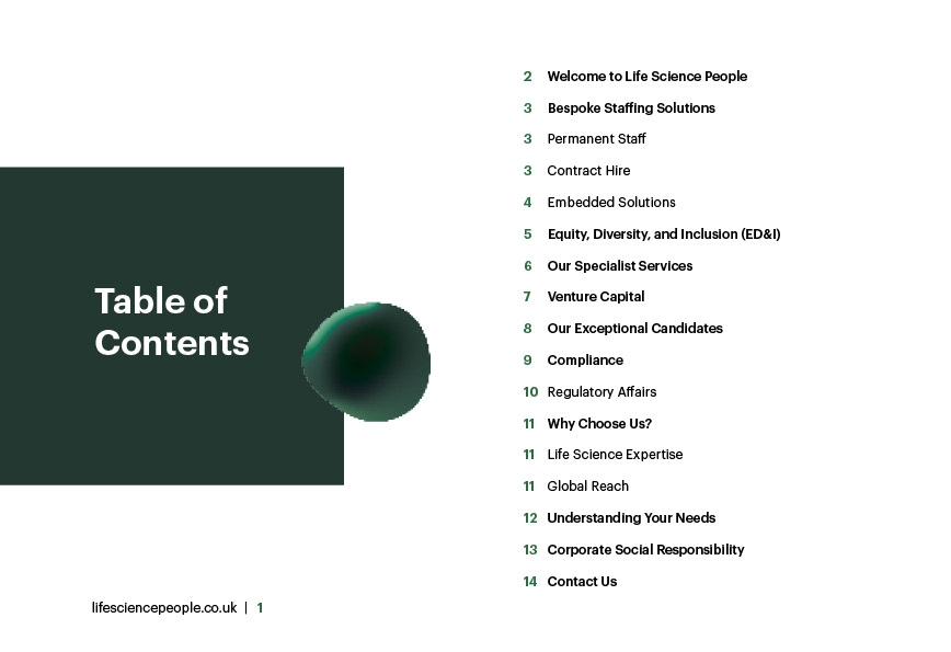
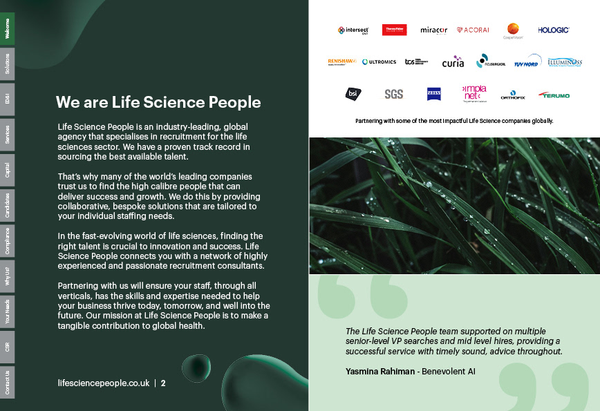
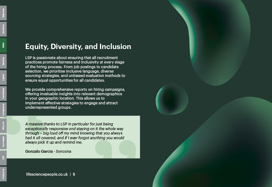
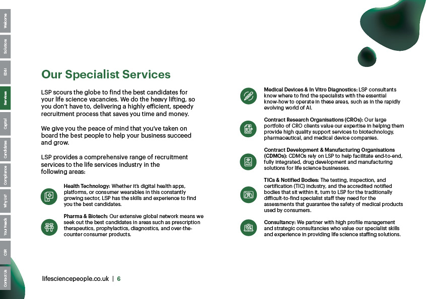
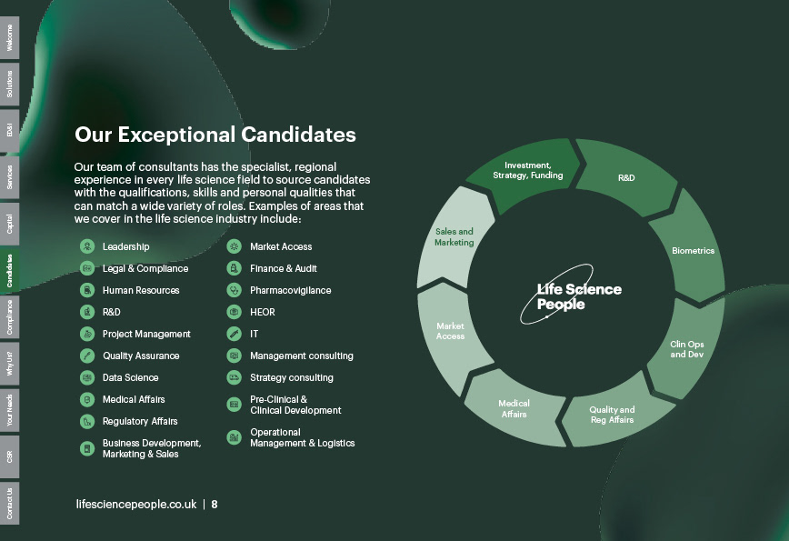
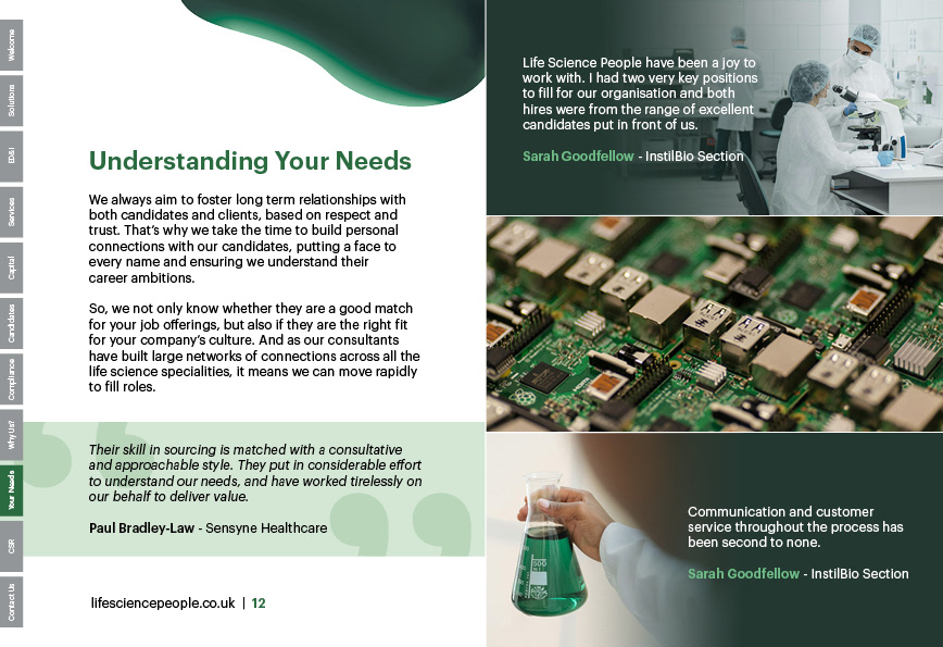
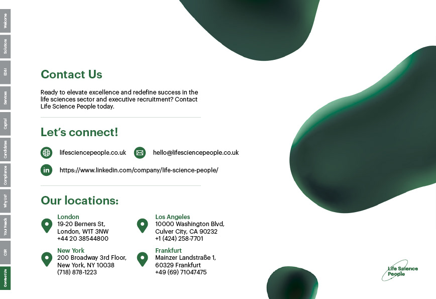
Life Science People required a proposition brochure setting out their full offer, from bespoke staffing through to compliance and corporate social responsibility. It needed to work both as a printed A5 document and on screen, across twenty-eight pages of largely uninterrupted body copy.
A deep green palette and soft organic gradient forms were used to frame each spread without competing with the copy, with pale green testimonial panels breaking the reading rhythm throughout. The A5 portrait edition served as the reference layout, with the landscape version reflowed into two columns and a vertical tab system added down every page. Each of the eleven tabs links directly to its section and highlights when active, so readers can navigate straight to the category relevant to them rather than scrolling through the document.
Font: Graphik